The complete archive
Logo histories
Explore how the world’s most familiar identities changed through the years—and what each redesign reveals about the company, technology and culture behind it.
156 brand histories
Industry
Automotive
1936
BMW
German automaker known for premium cars, motorcycles, and performance engineering.
Hover to rewind · Open the story
1919
Citroën
Two engineering chevrons traveled from gears to grille badges and back into an oval.
Hover to rewind · Open the story
Not documented
Ferrari
Italian sports-car manufacturer and racing brand known for the Prancing Horse.
Hover to rewind · Open the story
1903
Ford
American automaker producing cars, trucks, commercial vehicles, and mobility technology.
Hover to rewind · Open the story
1938
General Motors
A century-old automotive institution softened its initials for an electric future.
Hover to rewind · Open the story
2023
Harley-Davidson
Follow the Harley-Davidson Bar & Shield from its early trademark history to the latest simplified mark.
Hover to rewind · Open the story
1981
Honda
Honda’s framed H opened up again as the company prepared a new electric-vehicle era.
Hover to rewind · Open the story
1965
Jaguar
British luxury car brand whose visual identity spans a serif wordmark and a modern geometric redesign.
Hover to rewind · Open the story
1953
Kia
An industrial maker’s badge evolved into one continuous, forward-rising signature.
Hover to rewind · Open the story
1974
Lamborghini
Explore Lamborghini’s bull-and-shield badge history and its modernized 2024 identity.
Hover to rewind · Open the story
1997
Mazda
A winged M inside an oval gives Mazda a compact symbol for motion and continuous growth.
Hover to rewind · Open the story
1909
Mercedes-Benz
How a star for land, sea, and air became an automotive icon.
Hover to rewind · Open the story
1914
Mitsubishi
Three red diamonds combine family crests, the company name, and more than a century of industrial history.
Hover to rewind · Open the story
1983
Nissan
The sun and name bar survived every shift from enamel badge to illuminated EV emblem.
Hover to rewind · Open the story
1946
Renault
A radiator badge became the diamond that defines a century of Renault design.
Hover to rewind · Open the story
Not documented
Suzuki
Japanese manufacturer of automobiles, motorcycles, and marine engines, identified by a red S.
Hover to rewind · Open the story
2003
Tesla
A stylized T moved from a shield into a standalone electric-vehicle emblem.
Hover to rewind · Open the story
1927
Volvo
An ancient iron symbol and accidental grille brace became a lasting sign of Swedish strength.
Hover to rewind · Open the story
1937
Volkswagen
German automaker producing passenger vehicles and mobility products for global markets.
Hover to rewind · Open the story
Industry
Energy
1931
Chevron
How a service-station emblem became a global energy hallmark.
Hover to rewind · Open the story
1870
ExxonMobil
Global energy and chemicals company formed through the 1999 merger of Exxon and Mobil.
Hover to rewind · Open the story
2003
TotalEnergies
Global integrated energy company operating across fuels, gas, electricity, and renewables.
Hover to rewind · Open the story
1900
Shell
Global energy company active in fuels, chemicals, retail, and energy solutions.
Hover to rewind · Open the story
1989
BP
Global energy company involved in fuels, convenience, and lower-carbon energy businesses.
Hover to rewind · Open the story
Industry
Entertainment
Industry
Fashion & Apparel
1972
Adidas
Global sportswear company creating athletic footwear, apparel, and sporting goods.
Hover to rewind · Open the story
1977
ASICS
Japanese sportswear company specializing in athletic footwear and performance apparel.
Hover to rewind · Open the story
2003
Converse
Footwear brand known for Chuck Taylor All Star shoes and the Star Chevron symbol.
Hover to rewind · Open the story
1986
Gap
White serif letters inside a navy square became a durable badge for accessible American casual style.
Hover to rewind · Open the story
1968
H&M
The long Hennes & Mauritz name became an energetic red handwritten abbreviation built for storefront recognition.
Hover to rewind · Open the story
1886
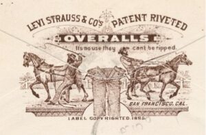
Levi’s
American denim brand known for blue jeans, the Red Tab, and Batwing logo.
Hover to rewind · Open the story
Not documented
New Balance
Footwear and apparel company known for running shoes and its NB monogram.
Hover to rewind · Open the story
1948
PUMA
German sportswear company known for athletic footwear, apparel, and its leaping cat.
Hover to rewind · Open the story
2019
Reebok
Sportswear brand making athletic footwear and apparel, recognized by its Vector logo.
Hover to rewind · Open the story
Not documented
Rolex
Explore the Rolex wordmark and crown emblem, with the crown’s 1931 registration grounded in company history.
Hover to rewind · Open the story
Not documented
The North Face
Outdoor apparel and gear brand recognized for its Half Dome logo and exploration heritage.
Hover to rewind · Open the story
1999
UNIQLO
Red English and Japanese tiles turn a retail name into a modular global fashion signature.
Hover to rewind · Open the story
2019
Zara
A tightly spaced serif wordmark gives fast-moving global retail the authority of a fashion masthead.
Hover to rewind · Open the story
1964
Nike
Global sportswear company designing athletic footwear, apparel, and equipment.
Hover to rewind · Open the story
Industry
Financial Services
1955
Chase
A complicated banking seal gave way to one of America’s earliest abstract corporate symbols.
Hover to rewind · Open the story
Industry
Food & Beverage
2006
Baskin-Robbins
The number 31 hides inside the BR initials as a lasting promise of ice-cream variety.
Hover to rewind · Open the story
1977
Dunkin’
A long coffee-and-donut name became the conversational Dunkin’ customers already used.
Hover to rewind · Open the story
2018
Fanta
Compare Fanta’s earlier orange-and-green treatment with the refreshed logo announced in 2023.
Hover to rewind · Open the story
1928
General Mills
Follow General Mills from its 1928 millwheel seal through the blue Big G and 2017 heart-accented logo.
Hover to rewind · Open the story
1862
Guinness
The Guinness harp is among the oldest enduring symbols in brewing; see its documented story and modern wordmark.
Hover to rewind · Open the story
1952
KFC
Global fried-chicken restaurant brand centered on Colonel Sanders and its red bucket.
Hover to rewind · Open the story
2007
Lay’s
A red ribbon across a golden sun turned Lay’s into a bright, appetite-led package signature.
Hover to rewind · Open the story
1868
Nestlé
Follow Nestlé’s bird’s-nest trademark from its 1868 origins to the warmer, simplified current identity.
Hover to rewind · Open the story
2008
Pizza Hut
A simple red roof has identified Pizza Hut restaurants across decades of changing typography.
Hover to rewind · Open the story
1971
Starbucks
Global coffeehouse company known for coffee, beverages, and neighborhood cafés.
Hover to rewind · Open the story
2002
Subway
Two directional arrows survived every major redesign of Subway’s restaurant wordmark.
Hover to rewind · Open the story
2023
Taco Bell
Track Taco Bell’s bell emblem from the 2016 redesign to its current simplified 2023 presentation.
Hover to rewind · Open the story
1969
Wendy’s
A founder’s daughter became a restaurant mascot whose pigtails survived every major redesign.
Hover to rewind · Open the story
1898
Pepsi
Global beverage brand known for cola and a broad portfolio of soft drinks.
Hover to rewind · Open the story
1890
Coca-Cola
Global beverage company best known for its namesake sparkling soft drink.
Hover to rewind · Open the story
1940
McDonald’s
Global restaurant company known for burgers, fries, and quick-service dining.
Hover to rewind · Open the story
Industry
Media & Streaming
2021
BBC
From the BBC’s boxed initials to its refreshed 2021 presentation, see the broadcaster’s restrained logo evolution.
Hover to rewind · Open the story
1981
MTV
MTV’s hand-drawn M and bold TV lettering began in 1981 and became a flexible symbol for music television.
Hover to rewind · Open the story
1956
NBC
A color-TV promotion became the six-feather peacock that now identifies an entire broadcast network.
Hover to rewind · Open the story
1914
Paramount
A mountain surrounded by stars became one of film history’s most durable studio signatures.
Hover to rewind · Open the story
Industry
Retail & E-commerce
2017
ALDI
A striped A inside a blue frame became a bright, unmistakable sign for efficient grocery retail.
Hover to rewind · Open the story
1989
Best Buy
The famous yellow price tag moved from enclosing the name to punctuating a cleaner digital wordmark.
Hover to rewind · Open the story
1976
Costco
A straightforward red warehouse name gained blue speed lines as Costco became a global membership retailer.
Hover to rewind · Open the story
1999
eBay
Global online marketplace connecting buyers and sellers across many product categories.
Hover to rewind · Open the story
2005
Etsy
A warm orange serif wordmark gives a digital marketplace the character of a crafted shop sign.
Hover to rewind · Open the story
1951
IKEA
A Swedish furniture name refined through seals, ovals and national colors into a retail icon.
Hover to rewind · Open the story
2019
Kroger
A familiar blue name gained softer curves and a shopping-cart smile for modern grocery retail.
Hover to rewind · Open the story
1979
The Home Depot
A hand-stenciled orange crate mark has carried the DIY warehouse idea with remarkable consistency.
Hover to rewind · Open the story
1995
Amazon
Global technology and retail company spanning e-commerce, cloud computing, and entertainment.
Hover to rewind · Open the story
1962
Target
American retailer offering everyday goods through stores and digital shopping services.
Hover to rewind · Open the story
Industry
Shipping & Logistics
1973
FedEx
A global delivery network whose famous wordmark hides forward motion in negative space.
Hover to rewind · Open the story
1928
Maersk
A seven-pointed family star evolved from a ship-funnel emblem into a worldwide logistics signature.
Hover to rewind · Open the story
Industry
Technology
1978
3M
The compact red 3M mark has endured since the late 1970s; follow the company’s documented identity milestones.
Hover to rewind · Open the story
2001
Acer
Taiwanese computer and electronics company identified by a green lowercase wordmark.
Hover to rewind · Open the story
1990
AMD
Two right-angle forms create an outward arrow that has endured across decades of processor innovation.
Hover to rewind · Open the story
2015
Android
The friendly Android robot moved from flat mascot to a flexible three-dimensional character.
Hover to rewind · Open the story
1976
Apple
Technology company known for consumer devices, software, services, and digital media.
Hover to rewind · Open the story
1989
ASUS
Taiwanese computer hardware and electronics company with a connected four-letter wordmark.
Hover to rewind · Open the story
1921
AT&T
The Bell System became a globe—and the globe opened up for a connected era.
Hover to rewind · Open the story
1973
Atari
Discover the Atari Fuji mark, its Pong-inspired design story, and later wordmark treatments.
Hover to rewind · Open the story
1934
Canon
A prototype’s spiritual emblem evolved into one of technology’s most stable wordmarks.
Hover to rewind · Open the story
1990
Cisco
San Francisco’s Golden Gate Bridge became a compact signal of networking and connection.
Hover to rewind · Open the story
1989
Dell
A tilted E and circular badge gave way to a cleaner wordmark for a broader technology company.
Hover to rewind · Open the story
2007
Dropbox
An open box of diamonds became a flexible symbol for storing, sharing, and creating work.
Hover to rewind · Open the story
2013
GitHub
A sturdy wordmark and the Octocat family turned code collaboration into a recognizable developer brand.
Hover to rewind · Open the story
1964
HP
Two lowercase initials survived decades of technology change by staying inside a flexible circle.
Hover to rewind · Open the story
1924
IBM
How a globe became three initials—and three initials became eight iconic stripes.
Hover to rewind · Open the story
2010
Instagram
A detailed camera became one of the mobile era’s most recognizable gradient icons.
Hover to rewind · Open the story
2016
Kodak
A concise look at Kodak’s red-and-yellow wordmark and the visual history of a photography pioneer.
Hover to rewind · Open the story
1995
LG
South Korean electronics and appliance brand recognized by its circular face-shaped logo.
Hover to rewind · Open the story
2013
LinkedIn
A boxed “in” turned a long professional-network name into a compact social icon.
Hover to rewind · Open the story
2015
Meta / Facebook
A social-network wordmark became Meta’s continuous loop for a wider technology company.
Hover to rewind · Open the story
2005
Mozilla
Mozilla repeatedly turned internet culture—from dinosaurs to URLs—into an open-web identity.
Hover to rewind · Open the story
1993
NVIDIA
An eye-like spiral became a lasting symbol for computer graphics, vision, and accelerated computing.
Hover to rewind · Open the story
2010
Pinterest
A pin-shaped script P became a compact red badge for visual discovery.
Hover to rewind · Open the story
2005
Reddit
Snoo grew from an informal sketch into a flexible symbol for online conversation.
Hover to rewind · Open the story
2013
Slack
A lively hashtag became a more disciplined four-color pinwheel for workplace communication.
Hover to rewind · Open the story
1973
Sony
Careful refinements turned a serif company name into a remarkably durable global technology signature.
Hover to rewind · Open the story
2013
Telegram
A white paper plane on blue became a direct visual metaphor for fast, lightweight messaging.
Hover to rewind · Open the story
2016
TikTok
A vibrating musical note became a compact emblem for mobile video culture.
Hover to rewind · Open the story
2009
WhatsApp
A telephone handset inside a speech bubble became a universal symbol for private mobile conversation.
Hover to rewind · Open the story
1968
Xerox
A name synonymous with copying repeatedly adapted to a much broader document business.
Hover to rewind · Open the story
1994
Yahoo
Playful lettering and a famous exclamation point matured into a cleaner purple digital brand.
Hover to rewind · Open the story
1975
Microsoft
Global technology company creating software, cloud services, devices, and gaming products.
Hover to rewind · Open the story
2006
Twitter / X
Social media platform built around public posts, conversations, and real-time updates.
Hover to rewind · Open the story
2004
Firefox
Open-source web browser developed by Mozilla with a focus on an open internet.
Hover to rewind · Open the story
Industry
Telecommunications
2018
Ericsson
Swedish telecommunications technology company recognized by three rounded diagonal bars.
Hover to rewind · Open the story
Not documented
Nokia
Finnish network-technology company whose corporate identity changed to open geometric lettering in 2023.
Hover to rewind · Open the story
2002
T-Mobile
Signature magenta and a distinctive T turned a long telecom name into an immediate retail signal.
Hover to rewind · Open the story
2000
Verizon
A sweeping checkmark was reduced, then reimagined as a glowing red-and-yellow V.
Hover to rewind · Open the story
Industry
Toys & Entertainment
1998
Hasbro
A playful smile and tilted tile turn a corporate toy name into an approachable promise of play.
Hover to rewind · Open the story
1970s
Nintendo
Japanese entertainment company known for Nintendo hardware and game franchises.
Hover to rewind · Open the story
1994
PlayStation
Sony interactive entertainment brand spanning consoles, games, and network services.
Hover to rewind · Open the story
1934
LEGO
Danish toy company known worldwide for its interlocking plastic building bricks.
Hover to rewind · Open the story
2019
Mattel
Global toy company behind dolls, games, vehicles, and family entertainment brands.
Hover to rewind · Open the story
Industry
Travel & Hospitality
1967
American Airlines
U.S. airline whose identity combines the eagle, national colors, and the idea of flight.
Hover to rewind · Open the story
1962
Delta Air Lines
A simple triangular widget grew from a jet-age badge into an enduring symbol of flight.
Hover to rewind · Open the story
2009
Hilton
Global hospitality company operating hotels and resorts across numerous brands.
Hover to rewind · Open the story
1991
KLM
KLM’s crown-and-wordmark combines a royal emblem with a clean airline identity designed by F. H. K. Henrion.
Hover to rewind · Open the story
2016
Uber
An abstract ride-hailing identity returned to a direct, highly legible wordmark.
Hover to rewind · Open the story
2010
Airbnb
Online marketplace connecting travelers with stays and experiences offered by hosts.
Hover to rewind · Open the story
1960s
Marriott
Global hospitality company operating hotels, resorts, and extended-stay properties.
Hover to rewind · Open the story
No matching histories—yet.
Try another name, letter or industry.
Every redesign leaves a trail.
Each profile begins with a visual lineage, followed by a researched account of the decisions, people and changing needs that shaped the identity.
We prioritize official company announcements, original designers and design agencies. Historical artwork is shown for identification, criticism, commentary and education.


2012