1900—1904
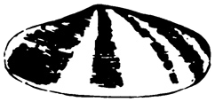
The original mussel
A detailed black-and-white shell directly illustrated the company name and became Shellu2019s first trademark.
Official source: Shell u2014 Our brand history


Brand at a glance
Six documented eras show a naturalistic mussel becoming Raymond Loewy’s geometric Pecten, followed by the warmer red-and-yellow master mark used today.
A detailed black-and-white shell directly illustrated the company name and became Shellu2019s first trademark.
Official source: Shell u2014 Our brand history
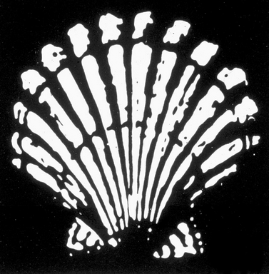
A front-facing scallop introduced the symmetrical fan of radiating ribs that would become the enduring Pecten structure.
Official source: Shell u2014 Our brand history

A controlled drawing made the shell more suitable for packaging, vehicles and signage across a growing network.
Official source: Shell u2014 Our brand history

Red, yellow and the Shell name turned the emblem into a bold retail beacon, followed by production-led simplification in the 1950s.
Official source: Shell u2014 Our brand history
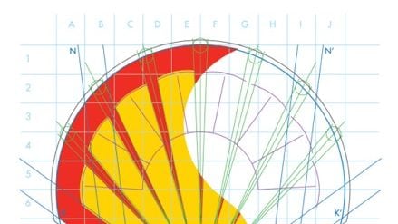
Raymond Loewy reduced the shell to a disciplined geometric system. The company name moved outside the emblem, leaving the Pecten strong enough to work as a symbol in its own right.
Official source: Shell - Our brand history
Shell retained Loewy’s established structure while introducing warmer red and yellow in the early 1990s. The current master mark preserves that familiar geometry and color relationship.
Official source: Shell Pecten Master Print Logo production worksheet
Shell owns one of the clearest examples of progressive abstraction in corporate identity. A literal black-and-white shell became a formal scallop, then a high-contrast roadside sign and finally Raymond Loewy’s geometric Pecten. Each step removed information while increasing recognition.
The Shell name traces to seashells imported by Marcus Samuel senior from the Far East. When his sons exported kerosene to Asia, they adopted the name for the business. The first trademarked emblem in 1900 was a detailed black-and-white mussel shell—closer to a specimen illustration than a modern logo.
In 1904 the image changed to a scallop viewed from the front. Its radiating ribs created a stronger, more symmetrical silhouette. That fan structure became the enduring idea even as illustration gave way to geometry.
Shell’s official history calls the scallop the Pecten, from the Latin name. In 1930 it gained a more formal drawing suitable for packaging, vehicles and signs, though local hand-rendering still produced many variations.
Red and yellow had appeared in Shell’s brand world for decades, possibly influenced by maritime signaling and the need for red kerosene cans to stand apart from Standard Oil’s blue. In 1948 those colors entered the Pecten prominently, and the Shell name appeared inside the symbol. The emblem was becoming a retail beacon rather than a naturalistic picture.
A simplified mid-century version reduced fine detail so printed transfers could be applied consistently to pumps, vehicles and shop signs. This was design shaped by infrastructure: a global network needs an identity that local operators can reproduce without redrawing it.
Industrial designer Raymond Loewy created the structure recognizable today. Strong red outlines, broad yellow fields and mathematically controlled curves made the shell readable at speed and at distance. The name moved outside the symbol and could eventually disappear when context made it unnecessary.
In the early 1990s, warmer red and yellow softened the identity and broadened its appeal. The underlying geometry remained stable. That longevity demonstrates the value of simplifying toward a distinctive structure rather than toward generic minimalism.
The current Pecten can identify a service station without saying “Shell.” Its journey from mussel to scallop to geometric fan was not arbitrary modernization: every revision improved visibility, reproduction or consistency. The object named the company; the company made the object its own; and repetition turned that object into a universal sign.
Shell’s official, extensively illustrated brand history documents the name, early marks, colors, production changes and Raymond Loewy’s 1971 design. Historical renderings are presented for identification, criticism, commentary and education. Shell and the Pecten are trademarks of Shell plc; LogoEvolve is not affiliated with Shell.
Shell demonstrates how a literal object can be reduced until it functions as an abstract badge. Compare its measured simplification with BP’s dramatic Helios redesign and Chevron’s stable stacked geometry.