A distinctive blue name anchors the grocery chain
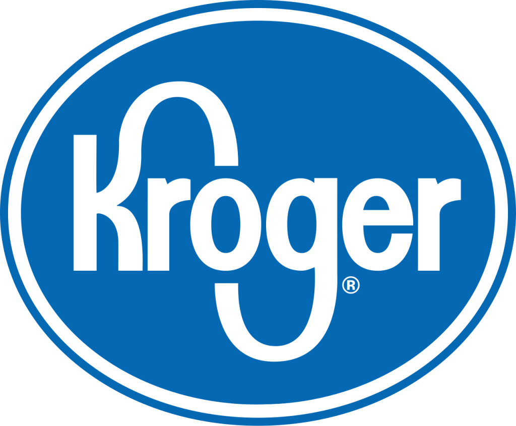
Kroger relied for decades on a recognizable wordmark with elongated letterforms and a strong blue color. The name itself became a dependable sign across many store formats and regional markets.
Digital grocery changes the customer journey
Pickup, delivery, loyalty apps, and prepared food expanded the identity beyond a building sign. The logo needed to feel useful and welcoming in interfaces as well as on large storefronts.
Fresh Cart adds movement and friendliness
The refreshed system softened the letters and introduced a curved cart-like smile beneath the name. It preserved blue recognition while giving the company a more energetic consumer voice.
Kroger’s evolution can be compared with Walmart and ALDI, grocery retailers that use a few strong shapes to connect physical and digital shopping.