The rare redesign that barely redesigned anything
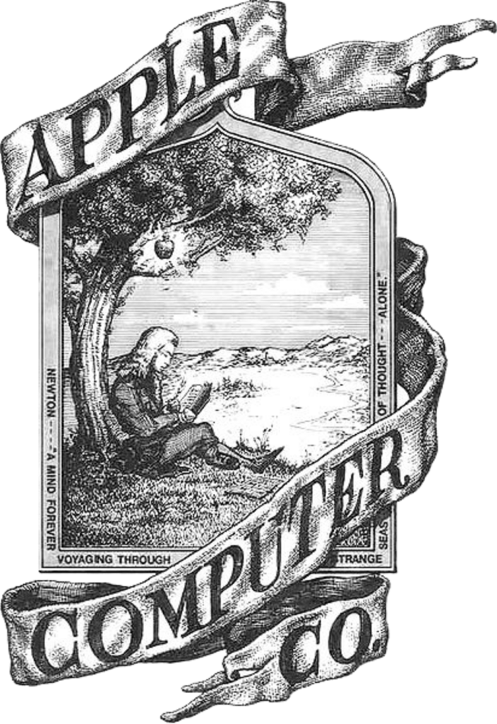
Most long-lived identities survive by being repeatedly redrawn. Apple’s story is stranger. The company’s first emblem was an intricate scene of Isaac Newton beneath an apple tree, but the identity people recognize today arrived almost immediately afterward. Since 1977, Apple has changed the color, material, depth, and context of its mark far more often than it has changed the underlying silhouette.
That consistency is the central idea behind the Apple logo: once a symbol becomes unmistakable, evolution can happen around it. The rainbow version belonged to the arrival of color personal computing. Translucent and dimensional versions matched the optimism of the early iMac era. Polished chrome felt at home on aluminum hardware. Flat monochrome now moves easily between a device, a store facade, a keynote screen, and a tiny interface.
A computer company that did not want to look like one
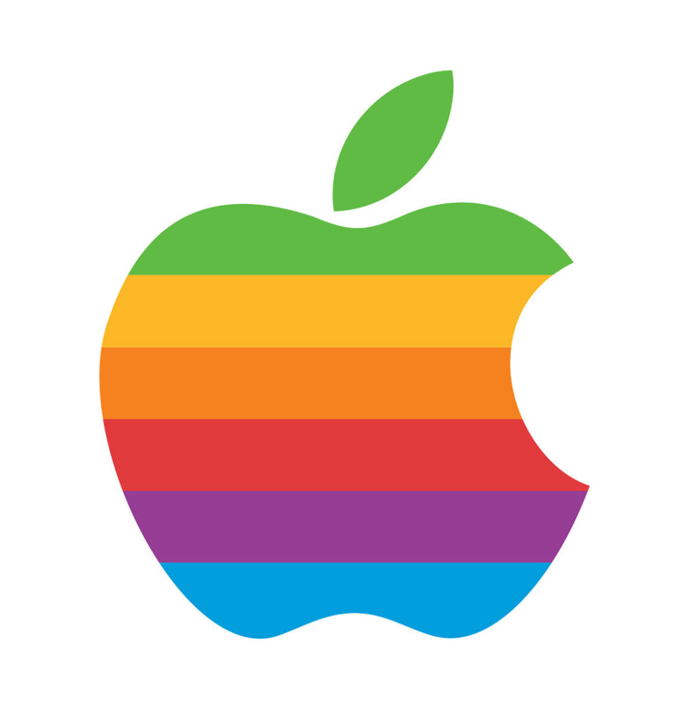
In 1977, personal computers were still unfamiliar, technical objects. Designer Rob Janoff was working at Regis McKenna when he was selected to develop an identity for the young Apple Computer. Rather than build another cold, mechanical technology mark, Janoff worked from the physical form of an apple. He drew and simplified it until the silhouette felt clear enough to function as an icon.
The bite was practical before it was mythical. It gave the fruit scale and helped keep the silhouette from being read as another round fruit. The famous “byte” interpretation is a memorable coincidence, but Janoff has consistently described a more direct design process. That mundane explanation is arguably more interesting: one of the world’s most analyzed symbols succeeded because a designer solved a legibility problem.
Why the rainbow mattered
The six horizontal colors were not merely decoration. They advertised an important capability of the Apple II: color output. At the same time, they softened the intimidating image of computing. The warm, irregular sequence made the machine feel creative, educational, and accessible—qualities that helped distinguish Apple from the corporate seriousness surrounding much of the technology industry.
The stripes also created a demanding production system. The logo required careful color registration in print and appeared across hardware badges, packaging, advertisements, signs, and software materials. That complexity was worth it while color itself was a strategic message. Once color computing was ordinary, the stripes no longer had to carry that burden.
The silhouette takes over
When Apple moved away from the rainbow treatment in the late 1990s, it did not discard the equity built over two decades. The bitten-apple outline stayed. What changed was the surface: translucent color, glossy dimensional treatments, brushed metal, chrome, white, and black all appeared as Apple’s products and interfaces changed.
This is what makes the identity unusually adaptable. A strong silhouette can absorb the visual language of an era without becoming unrecognizable. Even when rendered as a single flat color, the leaf, shoulders, lower lobes, and bite retain enough character to work without the company name beside them.
What actually evolved
- Complexity: a detailed illustrative crest gave way to a compact symbol that could scale.
- Message: rainbow stripes once demonstrated a product advantage; monochrome now signals confidence and universality.
- Material: the mark has repeatedly adopted the finish of Apple’s hardware and software—from translucent color to polished metal to flat interface graphics.
- Independence: recognition became strong enough that the symbol rarely needs a wordmark.
- Continuity: the bitten silhouette has remained the anchor, allowing stylistic changes without forcing audiences to relearn the identity.
Why it works
Apple’s logo demonstrates that brand evolution does not have to mean constant reinvention. The most effective change may be knowing which element has become culturally valuable and refusing to disturb it. Janoff’s form is simple, but it is not generic: the bite creates distinction, the leaf establishes orientation, and the asymmetry gives the mark personality.
That durable structure lets Apple respond to new media without chasing novelty. The logo can be luminous on a laptop lid, architectural on a store, minute on a watch, or nearly invisible as a tone-on-tone hardware detail. Its history is less a sequence of unrelated redesigns than a decades-long demonstration of how one symbol can keep learning new visual languages.
Source notes
Accounts of famous logos accumulate myths quickly. This profile prioritizes Rob Janoff’s account of the original assignment, his agency biography, and Apple’s own fiftieth-anniversary retrospective. Artwork displayed in the timeline is used for identification and historical commentary and is attributed in the media library and timeline source links.
Apple’s confidence in a standalone silhouette parallels Nike’s use of the Swoosh, while its long shift toward flatter digital presentation resembles the simplification seen at Microsoft.