A mail-order name searches for its visual voice
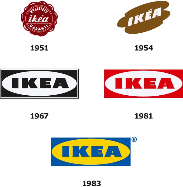
IKEA began in 1943, but its early identity was far from the uniform blue-and-yellow mark seen around the world today. The company’s official heritage material shows a decorative 1951 quality seal, a loose handwritten form in 1954 and a more architectural black-and-white treatment in 1967. Those shifts reflect a young mail-order business learning how to make a short invented name recognizable across catalogs, packaging and storefronts.
The four letters already carried a useful story. IKEA combines the initials of founder Ingvar Kamprad with Elmtaryd, the farm where he grew up, and Agunnaryd, the nearby village. Because the name was compact and unusual, designers could repeatedly reshape it without losing the core verbal identity.
The oval and rectangle create a durable container
The 1967 design introduced the basic construction that still defines IKEA: heavy letters contained by an oval, itself held inside a rectangle. That nested geometry made the mark feel like a sign, label and product stamp at the same time. A red-and-white version followed in 1981, proving that the structure was strong even before its best-known colors arrived.
In 1983, blue and yellow locked the identity to IKEA’s Swedish roots. The color combination also created exceptional visibility on warehouse-scale buildings and wayfinding. Like Target and Walmart, IKEA built recognition by applying a small set of visual cues relentlessly across an enormous physical retail network.
A careful update for digital reproduction
IKEA says the mark went largely unchanged from the 1980s until a subtle update in 2018. The goal was not reinvention. It was better legibility, recognition and color consistency across screens, signs, packaging and printed material. Small adjustments improved the balance between the oval, rectangle and lettering while preserving the silhouette customers already knew.
That restraint is central to the identity’s success. The logo feels stable because every modernization protects the compact wordmark, the enclosing oval and the blue-and-yellow palette. The result can sit on a tiny mobile interface or span the side of a destination store without changing character.
Swedish cues with worldwide reach
The modern IKEA mark turns national color into a practical navigation tool. Its bright palette is friendly, inexpensive to recognize and difficult to confuse with competitors. The wordmark’s thick customized lettering remains readable from a distance, while the rectangular outer field works naturally as signage.
IKEA’s evolution shows how a company can experiment early, discover a strong structural idea, and then improve it without sacrificing memory. That pattern also appears in enduring retail identities such as Costco: familiarity becomes an asset when the core mark is distinctive enough to survive decades of expansion.