1921—1964
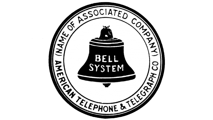
The Bell System seal becomes a national signature
A bell inside a ring connected the inventor’s name with a coordinated telephone network.
Official source: AT&T official brand history


Brand at a glance
Trace AT&T from the Bell System’s ringed emblems through Saul Bass’s striped globe and the open, digital-first globe used today.
A bell inside a ring connected the inventor’s name with a coordinated telephone network.
Official source: AT&T official brand history

Curved blue bands and lowercase lettering adapted the network symbol to wireless and broadband services.
Official source: AT&T official brand history
A flat, simplified construction improved clarity while preserving the familiar circular network idea.
Official source: AT&T official brand history
AT&T’s identity grew from the Bell Telephone system, whose earliest emblems placed a literal bell inside a circular seal. The image connected Alexander Graham Bell’s name with the new technology and helped many related operating companies appear as parts of one network. As telephone service expanded, the surrounding wording changed, but the bell remained the reassuring center.
During the twentieth century, American Telephone and Telegraph increasingly presented itself as AT&T. Official company archives show successive seals becoming cleaner and more standardized. The identity still carried institutional weight, but the typography and geometry gradually prepared it for mass advertising, equipment labels, directories, and television.
After the 1984 breakup of the Bell System, AT&T needed a symbol that no longer depended on the divested local bell companies. Saul Bass created a sphere built from horizontal bands. Nicknamed the “Death Star,” it suggested global reach, data moving across a network, and a company entering a new competitive era. Like the striped IBM mark, it created motion with repeated lines rather than a literal illustration.
Following the SBC acquisition and adoption of the AT&T name, the 2005 identity redrew the globe with curved blue ribbons and highlights. Lowercase lettering softened the corporate voice. The mark was designed for screens as well as physical applications, reflecting a business spanning wireless, broadband, and entertainment.
The 2015–2016 refinement flattened the globe, opened its construction, and restored a more direct uppercase wordmark. The simpler system scales cleanly from a phone screen to a stadium. Across more than a century, the lineage moved from a named inventor’s bell to an abstract network—while preserving the circular structure that ties the eras together.