Two letters inside one enduring circle
Volkswagen’s logo has survived extraordinary changes in company, culture and technology because its central construction is so strong: a V stacked over a W inside a circle. The evolution is visible less in the idea than in the treatment—industrial severity, postwar clarity, chrome-like depth and finally a flat digital line.
1937: machinery around the monogram
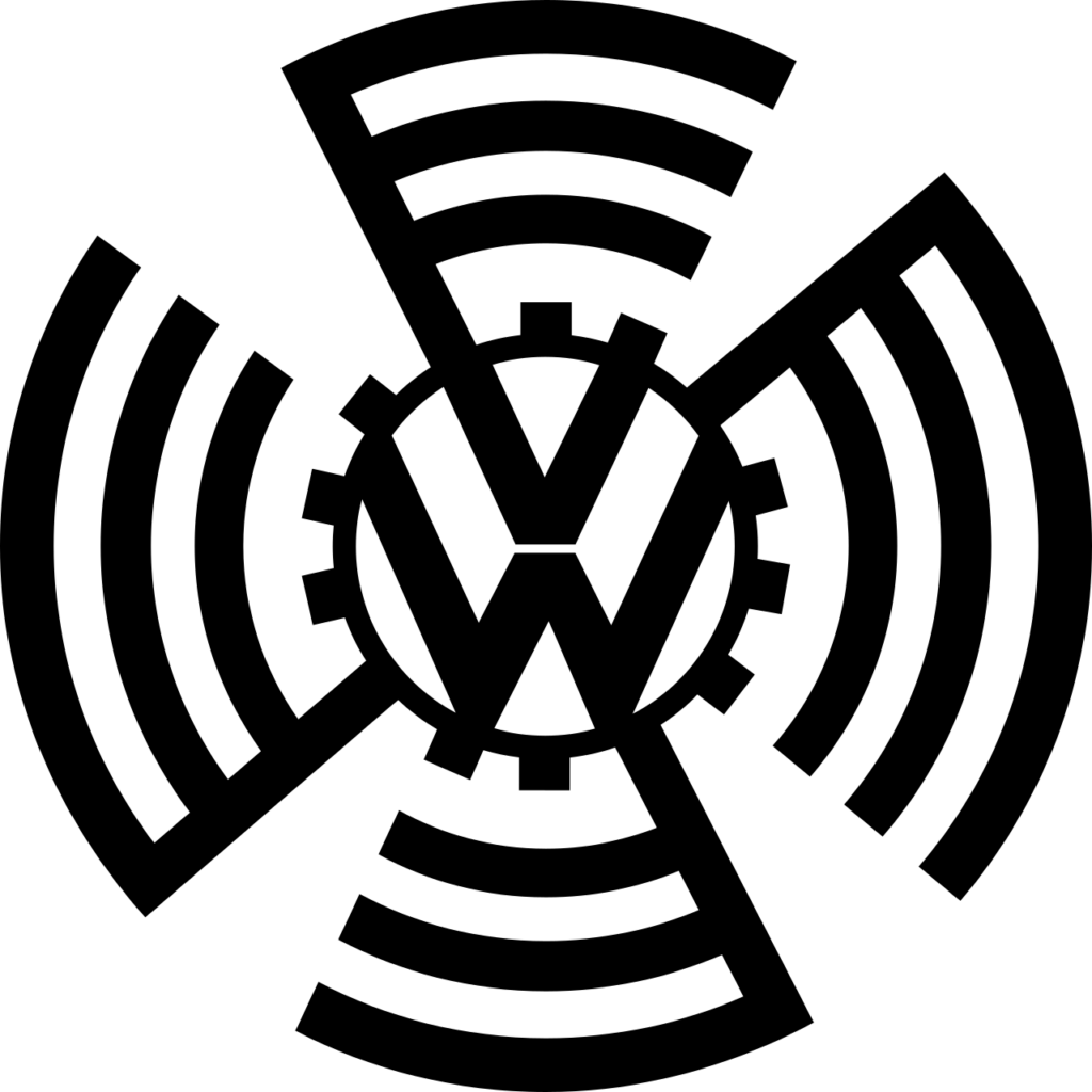
The earliest mark placed the VW monogram inside a cogwheel and surrounding radial forms. It looked mechanical and propagandistic, reflecting the political circumstances of the company’s founding. That outer machinery was later removed, allowing the basic letters-and-circle device to outlive the context that produced it.
Postwar versions became cleaner and more neutral. The V and W were drawn as a unified geometric construction, and the circle gave the badge the completeness required for a vehicle grille, hubcap or steering wheel.
From flat badge to dimensional chrome
Through the late twentieth century, the logo alternated between dark, light and blue treatments while retaining the same monogram. In 2000 Volkswagen adopted a glossy, dimensional blue badge. Gradients, shadows and highlights made the mark resemble polished metal and glass, matching an era when digital interfaces and automotive advertising favored physical-looking surfaces.
The 3D treatment communicated finish and engineering, but it carried many tonal details. As brand experiences moved onto small screens and flexible digital platforms, those effects made the badge harder to reproduce consistently.
2019: essential, flat and flexible
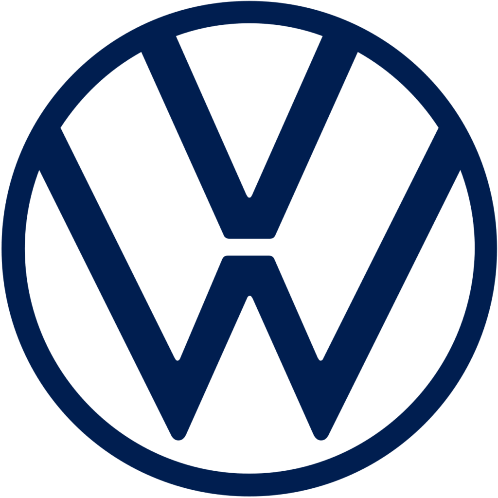
Volkswagen unveiled a new brand design in 2019. The logo returned to a flat, two-dimensional construction reduced to essential elements. The W was separated from the lower circle, opening a small gap that makes the geometry breathe. Volkswagen described the result as clearer, more flexible and suitable for digital applications.
The launch accompanied a broader strategic reset and the arrival of a new generation of electric vehicles. Rather than invent a futuristic symbol, Volkswagen recovered the clarity already present in its historical mark. Motion, sound and adaptable color could now live around a stable line logo.
Why the monogram endures
The VW roundel works because it belongs naturally on both a product and a screen. It reads as a company initial, a precision badge and a balanced piece of geometry. Surface fashion can come and go; the nested letters remain unmistakable. The 2019 redesign is a strong example of simplification as restoration rather than erasure.
Sources and image notes
Volkswagen’s official 2019 brand-design announcement explains the flat logo, essential elements and digital flexibility. Historical marks are shown for identification, criticism, commentary and education. Volkswagen and the VW roundel are trademarks of Volkswagen AG; LogoEvolve is not affiliated with Volkswagen.
Volkswagen’s stacked-letter roundel shares the durability of Audi’s rings and Mercedes-Benz’s star, with recent changes focused more on depth, spacing, and digital clarity than reinvention.
For another identity comparison, explore the Porsche logo history.
For another identity comparison, explore the Škoda logo history.