The full name gives way to the nickname
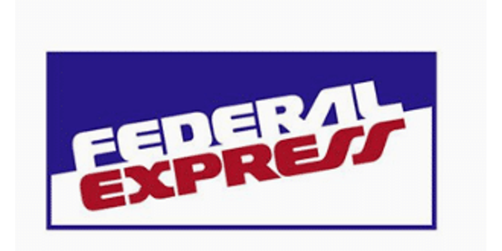
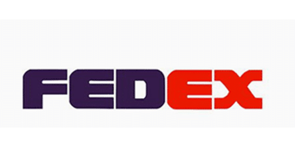
The first identity made “Federal Express” impossible to miss. White and red italic capitals crossed a sharply divided field, turning the complete company name into a badge that could be read on aircraft, trucks and packages. By the early 1990s, an uppercase FEDEX transition acknowledged the abbreviation customers were already using while retaining the established purple-and-red palette.
That interim mark matters because it shows that the 1994 redesign was not simply a spontaneous shortening. The business had already learned that the compact name traveled better internationally. Landor’s later mixed-case wordmark solved the remaining problem: it made the shorter name more distinctive and embedded forward movement directly into its negative space.
A shortened name makes speed easier to see
Federal Express began operating in 1973, but customers and employees naturally shortened the long corporate name to FedEx. The nickname was faster to say and easier to place on packages, aircraft and delivery vehicles. In 1994 the company made that familiar abbreviation the center of a new identity designed by Landor.
The wordmark appears simple until the space between the E and x is noticed. Those letterforms create a forward-pointing arrow without adding a separate symbol. The device reinforces movement, precision and direction while allowing the company name to remain the entire logo. FedEx’s 1994 annual report described the updated identity as clearer and more contemporary, and explicitly connected the embedded arrow with speed and forward motion.
Color distinguishes the network
The original corporate version paired purple “Fed” with a gray “Ex.” As FedEx expanded, different operating companies used different colors for the second half of the name. Orange identified FedEx Express, green appeared with Ground and other combinations distinguished Freight, Office and additional services. The consistent letter construction kept the family recognizable even when the suffix color changed.
In 2016 FedEx began moving the parent identity to the familiar purple-and-orange treatment. That consolidation gave the overall brand more energy and aligned the corporate mark with the best-known part of its delivery network. The change did not disturb the arrow or the tightly fitted letterforms; it strengthened a system that already had decades of recognition.
The hidden arrow rewards a second look
FedEx demonstrates how negative space can carry meaning without becoming a gimmick. The arrow is not pasted beside the name—it emerges from the typography, so the logo still works for viewers who never consciously notice it. Compare that economy with the shield of UPS and the speed lines of DHL. Each logistics company signals reliable movement, but FedEx makes the idea visible inside its name.
The FedEx brand family
These marks existed alongside the corporate identity. They identify operating companies and services rather than successive replacements for the main FedEx logo.
FedEx Express
The original overnight air business adopted the Express name in 2000 when FedEx Corporation organized its broader portfolio.
FedEx Ground and Home Delivery
RPS became FedEx Ground in 2000. FedEx Home Delivery launched that year as its residential-delivery service, not as a separate corporate successor.
FedEx Freight
Created in 2001 from acquired less-than-truckload carriers, Freight extended the shared wordmark into heavyweight shipping.
FedEx Office
Kinko’s joined FedEx in 2004 and became FedEx Office in 2008, pairing the wordmark with printing and business services.