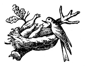
A family symbol becomes a corporate signature
Henri Nestlé drew on his family coat of arms when creating the bird’s-nest trademark for his infant cereal. Nestlé’s archive dates the trademark to 1868 and records later refinements that kept the nest as the identity’s central idea.
Simplification without abandoning the nest
The company documents major stages in 1938, 1966, 1988, 1995 and 2015, describing the gradual joining and separation of the wordmark and emblem, followed by simplification for smaller screens. In 2018, the color shifted from gray to oak. That long continuity contrasts with the script-led identity of Coca-Cola and the bold wordmark of Pepsi.
Sources and image credit
Timeline and logo artwork are credited to Nestlé’s official logo-evolution archive. The artwork remains Nestlé’s trademark; this page is an independent historical commentary and is not affiliated with the company.