1934—1946

A new name for “play well”
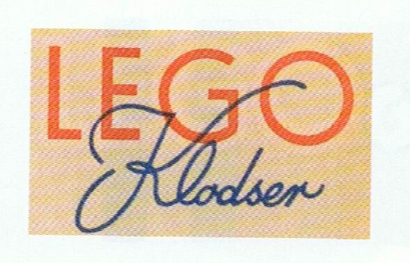
Early typographic experiments established the compact four-letter name selected from the Danish phrase “leg godt.”
Official source: LEGO History

Brand at a glance
Four distinct eras turn a carpenter’s early wordmark into the compact red-square badge recognized across generations of play.
Early typographic experiments established the compact four-letter name selected from the Danish phrase “leg godt.”
Official source: LEGO History
More dimensional and informal lettering moved LEGO away from a workshop stamp toward a child-centered identity.
Source: Wikimedia Commons archive
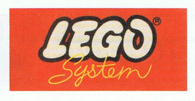
Red, white, yellow and black increasingly formed the high-contrast palette that would define LEGO on crowded toy shelves.
Source: Wikimedia Commons archive
LEGO removed “System” and the colored bars, tightening rounded white letters inside a red square with black and yellow contours. The 1998 refinement adjusted spacing and shapes without changing this unmistakable construction.
Official source: LEGO — A modern, international company
LEGO’s logo began as a carpenter’s mark and evolved into one of the world’s most recognizable toy badges. Its journey is a story of increasing concentration: loose lettering became a compact square, color became structural, and the name gained outlines strong enough to survive on packaging crowded with imagination.
Ole Kirk Kristiansen founded the company in Billund in 1932 and selected LEGO two years later from the Danish words “leg godt,” meaning “play well.” Early wordmarks varied because they were applied to wooden toys, stationery and workshop materials rather than governed by a global identity manual.
The 1934 treatments are typographic experiments—some formal, some more playful. Their importance lies in establishing the short, distinctive name. Four letters made the brand compact long before the square badge arrived.
Postwar versions became friendlier and more dimensional as the company entered plastics. Rounded letters and lively outlines moved the identity away from a manufacturer’s stamp toward a children’s brand. Red increasingly became the visual home of the name, while yellow and black added contrast.
The product itself reached a defining point in 1958 when the modern LEGO brick’s interlocking tube principle was launched. The identity was likewise moving toward a system: consistent enough to connect many sets, yet energetic enough to promise open-ended play.
The 1960s logo placed the name in a red square alongside “System” and horizontal color bars. The square was ideal for boxes and international retail, behaving like a seal that could remain stable while photography, illustrations and themes changed around it.
In 1973, LEGO removed the extra word and colored stripes. White letters, surrounded by black and yellow contours, filled the red square. The softer lettering was tightened, producing the essential arrangement still recognized today.
The 1998 update subtly tightened the composition and lettering for clearer reproduction. It did not discard the successful 1973 idea. The red field, yellow boundary, black shadow and white rounded name continued to create exceptional shelf presence.
LEGO’s logo works because it resembles the product’s design logic. It is modular, bounded and bold; every element has a job. The badge can sit on an elaborate Star Wars scene, a quiet architectural model or a preschool set without surrendering its identity. Like a reliable brick, it connects to many worlds while keeping the same underlying geometry.
The LEGO Group’s official history archive, 1973 logo account, and company history provide the principal dates. Historical renderings are presented for identification, criticism, commentary and education. LEGO and its logo are trademarks of the LEGO Group; LogoEvolve is not affiliated with the LEGO Group.
LEGO’s compact red-square badge behaves differently from the corporate identities of Mattel and Nintendo: it is both a company mark and a colorful presence designed to live directly on play products.