A family emblem becomes a shipping signature
The Maersk identity begins before Maersk itself. In 1886, Captain Peter Maersk Moller placed a white seven-pointed star on the pale-blue funnel band of his first steamship, LAURA. Maersk explains that the star commemorated a moment of hope during his wife Anna’s illness, giving the symbol a personal meaning before it became a commercial identifier.
When the Steamship Company Svendborg was established in 1904, the family star became its house flag. That continuity mattered: ships needed markings that could be recognized at a distance, so a simple light star against blue was both meaningful and practical.
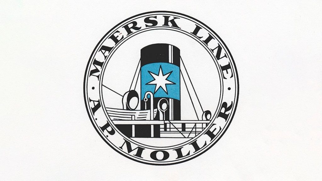
The 1928 liner logo formalizes the star
Maersk introduced its first official liner-service logo in 1928 while promoting routes between the United States and Asia. A.P. Moller said the design was developed from a photograph of a vessel’s funnel and its surroundings. The resulting badge translated a physical fleet marking into a repeatable identity for advertising, tickets and passenger communications.
Versions changed over the following decades, but the essential ingredients remained stable: the seven-pointed star, the blue field and the Maersk name. That consistency made the symbol useful across ships, offices and an expanding international network.
Acton Bjorn creates the modern system
At the beginning of the 1970s, Maersk asked Danish designer and architect Acton Bjorn to create an identity that would be recognizable, timeless, flexible and easy to remember. The new mark first appeared on three Maersk Air aircraft in 1972 before spreading across the wider group.
The redesign simplified the star and coordinated it with a strong wordmark. Instead of illustrating a ship or cargo, the identity could represent container transport, terminals, air services and logistics under one visual system. The pale blue retained a direct connection to the company’s funnels while becoming a distinctive corporate color.
A mark built for global movement
Maersk has kept the seven-pointed star because it works at radically different scales, from the side of a container ship to a digital tracking screen. Its durability resembles the disciplined transport identities of DHL, FedEx and UPS, but its family origin gives the symbol an unusually personal foundation.
The identity demonstrates how a practical fleet emblem can grow into a global corporate asset without losing its central form. Maersk has modernized the typography and applications around the star, while the star itself continues to connect present-day logistics with the company’s nineteenth-century maritime heritage.