A trademark that demonstrated the product
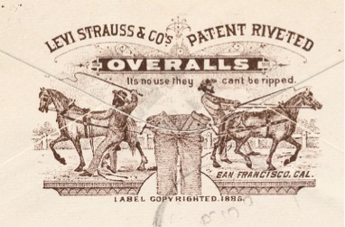
Levi’s visual history starts with proof. In 1886, Levi Strauss & Co. introduced the Two Horse trademark, showing two horses attempting to pull apart a pair of waist overalls. The official company history says the image symbolized the clothing’s strength. It was not an abstract promise: it staged durability as a scene anyone could understand.
That accessibility mattered in a broad and multilingual market. A customer did not need to know the company name or read a detailed advertisement to understand what the picture claimed. The garment at the center would hold. In this sense, the Two Horse mark functioned simultaneously as trademark, product demonstration, and story.
The Red Tab makes recognition immediate
Levi Strauss & Co. added the Red Tab to the right back pocket of its 501 jeans in 1936 to distinguish its products from competitors. This shifted identity from a printed label to a feature visible while the product was being worn. A small flash of red could identify the jeans from across a room, even when the leather patch and other labeling were hidden.
The Red Tab is important because it shows that branding does not have to live in a conventional logo box. Placement, color, and repetition can become identifiers in their own right. Its effectiveness came from consistency: the tab appeared in the same location, attached to the object whose authenticity it guaranteed.
From workwear evidence to cultural shorthand
As jeans moved beyond workwear, Levi’s needed an identity that could operate in fashion, retail, and mass communication. The red Batwing mark answered that need with a simple container and a strong wordmark. Its curved lower edge echoes the double-arc stitching and pocket geometry associated with Levi’s jeans, allowing the corporate signature to retain a physical connection to the product.
The white lettering against red produces immediate contrast. The unusual capitalization and apostrophe preserve the familiar spoken name, while the surrounding Batwing shape makes the wordmark recognizable even before every letter is read. It is compact enough for a garment tab yet assertive enough for storefronts and campaigns.
Why the system has several icons
Levi’s does not rely on one mark to carry its entire history. The Two Horse trademark communicates origin and durability. The Red Tab signals authenticity on the garment. The Batwing provides a contemporary commercial signature. Pocket stitching adds another product-level cue. These elements overlap, but they are not interchangeable; each works at a different distance and in a different context.
This layered approach distinguishes Levi’s from sportswear identities such as Nike or Adidas, whose primary symbols often dominate the product surface. Levi’s identity is frequently embedded in construction details, reflecting a brand whose authority begins with the garment itself.
What the logo preserves
The modern Batwing is far simpler than the illustrated Two Horse trademark, but it does not abandon the earlier identity’s logic. Both marks turn a product characteristic into a visual device. The horses dramatize resistance to tearing; the Batwing’s shape recalls the jeans’ pocket and stitching. In each case, recognition grows from something materially connected to denim.
That continuity helps explain why Levi’s can modernize its presentation without appearing detached from its past. The identity is not merely vintage decoration. It is a system of signs built from durability, construction, and the highly visible ways people wear the product.
Continue comparing related identity systems with H&M, Zara, UNIQLO, and Gap.