1946—1959
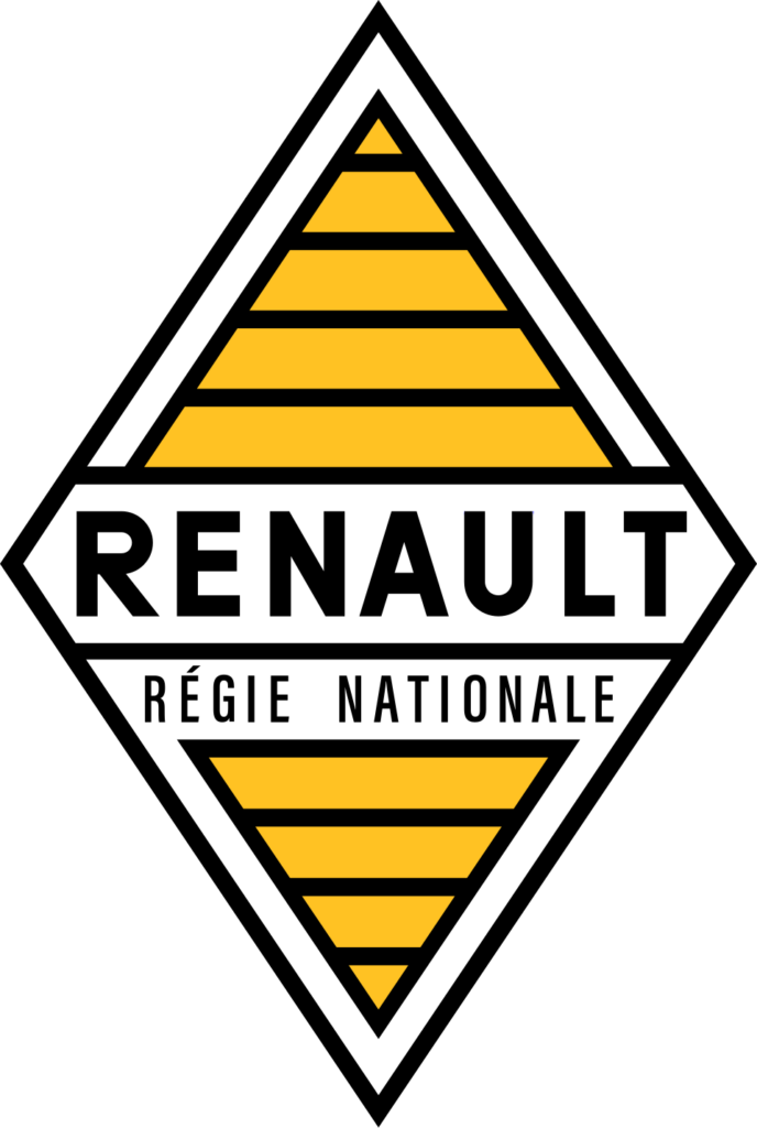
A postwar shield formalizes the diamond
The nationalized company combined its name and angular badge in a formal postwar identity.
Official source: Renault Group official history


Brand at a glance
Follow Renault from postwar badges to Victor Vasarely’s striped diamond and the flat interlocking emblem introduced in 2021.
The nationalized company combined its name and angular badge in a formal postwar identity.
Official source: Renault Group official history
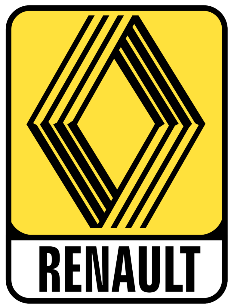
Parallel lines created an optical, name-free emblem that made the familiar geometry feel dynamic.
Official source: Renault Group official history
The flat emblem recalls Renault’s graphic heritage while improving motion and digital reproduction.
Official source: Renault Group official 2021 identity story
Renault began in 1898, and its earliest marks ranged from the founders’ intertwined initials to a gear-framed racing car. In 1923 the company put a functional grille badge on the nose of its vehicles. Angular bonnets soon encouraged an angular badge, and in 1925 the diamond became the lasting foundation of Renault’s identity.
After Renault was nationalized in 1945, the emblem combined the name, diamond geometry, and formal institutional language. It was more descriptive than later versions, but it fixed the proportions and central axis that made the badge recognizable on a vehicle moving through traffic.
In 1972, Victor Vasarely and his son Yvaral created a wider diamond from parallel lines. The name disappeared, allowing the form to stand alone. The result connected industrial precision with Op Art and made Renault’s badge feel simultaneously mechanical and kinetic. It is one of the strongest examples of an automaker commissioning a major artist to refine an established shape.
Later versions added volume, metallic surfaces, yellow framing, and then a larger vertical diamond. Those treatments helped the emblem behave like a physical grille badge, much as the marks of Volkswagen and BMW moved between dimensional and flat presentation.
Renault’s current mark returns to the idea of parallel paths. Two interlocking outlines create the diamond without gradients or a surrounding box. The company says the flat construction was built to animate well and function across screens and vehicles. It looks new while openly recalling the Vasarely era, proving that simplification can recover heritage rather than erase it.