A name that had to carry a changing company
TotalEnergies’ identity is closely tied to the way the company describes its business. The organization began in 1924 as Compagnie française des pétroles, and the Total brand was adopted in the 1950s as its downstream network expanded. Decades of growth and mergers eventually brought Total, PetroFina, and Elf Aquitaine together. By 2003, the shortened Total name and a new corporate identity were used to present the combined group as one organization.
The next major change came in 2021, when shareholders approved a change from Total to TotalEnergies. The company explicitly connected the new name and visual identity to its strategy of operating across multiple forms of energy. This makes the logo transition unusually direct: the identity was not introduced merely to refresh the company’s appearance, but to make a strategic claim visible in the name itself.
The 2003 Total sphere
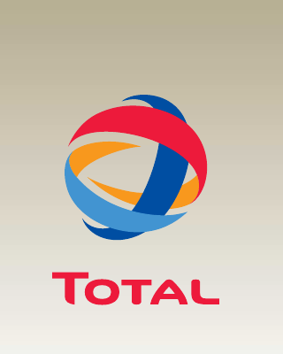
Total’s 2003 annual report explains that the corporate identity program began rolling out during that year across service stations, storage facilities, and production sites. The emblem used several curved ribbons to form a globe-like sphere, paired with the red Total wordmark. Its overlapping blue, light-blue, orange, and red bands suggested movement around a central form.
The symbol helped solve a problem created by corporate consolidation. TotalFinaElf had been an accurate record of mergers, but it was cumbersome as a public-facing name. Returning to Total simplified the verbal identity. The multicolored sphere then carried ideas that the shorter name could not express alone: international scale, multiple activities, and energy in motion.
The wordmark beneath the sphere remained strong and geometric. Its red color connected it to Total’s retail presence, while the emblem introduced greater visual depth than a flat service-station badge. Together they created a system that could identify both a consumer fuel network and a large industrial group.
Why Total became TotalEnergies
On May 28, 2021, the company announced that shareholders had approved the TotalEnergies name. Its official statement said the change anchored a strategic transformation into a broad energy company in the corporate identity. The plural “Energies” was therefore essential. It expanded the meaning of Total beyond oil and gas to include electricity, renewables, biofuels, biogas, hydrogen, and other activities identified by the company.
The name also retained Total rather than discarding it. That continuity matters. A completely new name might have communicated rupture, but TotalEnergies presents change as an extension of the established organization. The familiar word becomes the first half of a more descriptive commitment.
A ribbon drawn as an energy journey
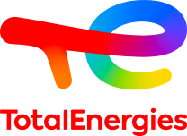
The 2021 logo replaces the enclosed sphere with a flowing multicolored ribbon that forms a stylized “T” and “E.” The stroke shifts through several colors instead of remaining inside a fixed border. Visually, it feels less like an object and more like a path. That sense of movement supports the company’s description of an energy journey and an identity in transformation.
Color performs a more explicit role than it did in many traditional petroleum identities. Rather than one dominant corporate color, the gradient suggests plurality. The company’s shareholder communication described the logo as dynamic, in motion, and multicolored to express different energies. The mark’s open structure reinforces that idea: it does not close into a badge or shield.
The wordmark becomes more explanatory
The modern wordmark spells TotalEnergies as one unit but uses capitalization to keep both concepts legible. “Total” preserves brand recognition, while “Energies” immediately tells the viewer how the company wants its scope understood. The typography is comparatively restrained because the ribbon already provides the expressive gesture.
This differs from the concise symbol strategies used by Shell and BP. Shell can rely on a century-old object, while BP’s Helios centers the identity on a single radiating form. TotalEnergies instead combines an abstract motion symbol with a more descriptive company name. Compared with ExxonMobil, whose post-merger identity preserves two existing names in a restrained wordmark, TotalEnergies uses both naming and color to announce a broader repositioning.
What changed—and what remained
The two identities share more than their different shapes initially suggest. Both use several colors, both convey motion, and both make the Total name prominent. The 2021 system did not abandon the visual language of plurality; it released that language from the 2003 sphere and redirected it into a forward-moving line.
That continuity helps the rebrand feel evolutionary despite the longer name and new emblem. The red associated with Total remains present, joined by blues, orange, and additional gradient transitions. The result recognizes the company’s existing visual equity while placing greater emphasis on movement and variety.
What the modern identity communicates
The TotalEnergies mark is designed to communicate aspiration as much as current operations. Its flowing construction avoids the heaviness of a seal, industrial shield, or static globe. The visual message is that the organization is moving through change rather than presenting itself as finished.
Whether that strategic transformation is judged by the logo or by the company’s activities is a separate question. As an identity system, however, the 2021 redesign is unusually transparent about its intended purpose. The name states the expanded category, the colors represent plurality, and the continuous ribbon turns transition itself into the central graphic idea.