From an ornate seal to a signature known worldwide
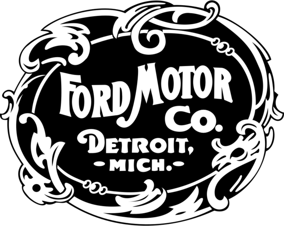
Ford’s logo history is often summarized as the story of a blue oval, but the oval arrived only after the company had already tried several ways of looking established. The first Ford Motor Company mark from 1903 was an elaborate border filled with flourishes. It suited an era when an automobile maker still needed to present itself like a formal industrial concern. The design communicated craftsmanship and permanence, yet it was too detailed to become the flexible badge a mass-market manufacturer would eventually need.
1903: credibility through ornament
The original emblem placed the company name inside an Art Nouveau-inspired frame. Its curled edges and tightly packed lettering made the mark feel closer to an engraved maker’s plate than a modern corporate identity. That was appropriate for a young company entering a risky new business. Cars were still unusual products, and the badge needed to make the manufacturer appear serious before it needed to be instantly recognizable at highway speed.
What the first logo lacked was reduction. Fine decorative lines disappear when reproduced small, stamped into metal or viewed from a distance. As Ford moved toward large-scale production, the identity had to become as direct and repeatable as the cars themselves.
1907: the script creates a human signature
Ford’s decisive visual asset was the handwritten name developed by Childe Harold Wills. Ford’s official company timeline says Wills designed the script in 1907 using a stencil set based on the handwriting style taught when he and Henry Ford were children. The result feels personal without being fragile: a flowing capital F, linked lowercase letters and an emphatic terminal stroke make the name read like an endorsement.
The script solved several problems at once. It shortened the identity to one word, connected the company to its founder and produced a silhouette that could survive on paperwork, advertisements and vehicle hardware. Even as the surrounding badge changed, the rhythm of the signature remained Ford’s most valuable visual constant.
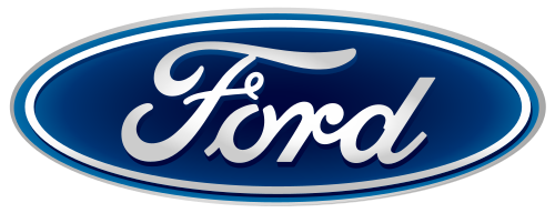
1927: the signature meets the Blue Oval
Ford states that the familiar oval was not placed on a car until the 1927 Model A. Enclosing the script created a compact badge with clear edges, while blue supplied a distinctive field for the white lettering. The shape also made the identity practical for grilles, hubcaps, dealerships and printed promotion. Instead of asking every application to accommodate the long signature, the oval gave the mark a dependable footprint.
Later versions introduced dimensional highlights, chrome-like rims and deeper gradients, reflecting the production techniques and tastes of their periods. Those effects gave the badge the appearance of a physical automotive emblem. In digital settings, however, extra reflections can become noise, so contemporary uses often favor a cleaner, flatter interpretation of the same blue-and-white system.
Why the current Ford mark still works
The present identity does not depend on novelty. Its power comes from disciplined continuity: the script keeps the founder connection, the oval acts as a stable container, and the blue field creates recognition before the word is fully read. Small refinements can improve spacing, contrast and reproduction without making customers relearn the brand.
Ford’s evolution is therefore less a sequence of reinventions than a search for the right frame around one enduring signature. Ornament established credibility, handwriting created ownership, and the Blue Oval turned that handwriting into a durable global badge.
Sources and image notes
Ford’s official company timeline documents the 1907 script and the Blue Oval’s appearance on the 1927 Model A. Historical renderings are preserved by Wikimedia Commons. The marks are shown for identification, criticism, commentary and education. Ford and the Blue Oval are trademarks of Ford Motor Company; LogoEvolve is not affiliated with Ford.
Ford’s enduring script-and-oval combination contrasts with the geometric badges of Toyota and Volkswagen, yet all three preserve familiar forms while refining their reproduction for new media.
For the corporate side of American automotive branding, explore the General Motors logo history.
Tesla takes the opposite route from Ford’s heritage script, relying on a sharp standalone T and engineered wordmark. Explore the Tesla logo history.
For another identity comparison, explore the Ferrari logo history.