Two pioneers, two visual traditions
Mercedes-Benz did not begin as a single company with a finished emblem. Daimler-Motoren-Gesellschaft and Benz & Cie. developed separately, and each brought a different visual idea to their eventual union. Benz used name-centered badges surrounded by gear teeth and later a laurel wreath. Daimler’s Mercedes marque found a simpler device: a three-pointed star.
Mercedes-Benz’s official history traces the star to Gottlieb Daimler, who marked his family home with a similar shape on a postcard. His sons Paul and Adolf adapted the idea as a company symbol in 1909. Its three points represented Daimler engines operating on land, at sea, and in the air—an ambitious summary of technical reach rather than a picture of one vehicle.
The ring gives the star a permanent frame
The first star stood alone. In 1916 it appeared within a broad ring carrying the Mercedes name and four smaller stars. Daimler registered a more vivid star-in-ring emblem in 1921, including its use as the three-dimensional radiator figure that became one of the most recognizable details in motoring.
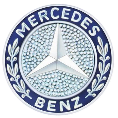
When Daimler and Benz merged in 1926, their identities merged too. The Mercedes star was paired with the Benz laurel wreath, and both company names surrounded the center. The combined badge made corporate history visible: Daimler supplied the star, Benz supplied the wreath, and the new Mercedes-Benz name linked them.
Reduction turns an emblem into an icon
Over subsequent decades the badge lost much of its wording and botanical detail. The three-pointed star within a thin circle became strong enough to identify the marque on its own. Later systems paired that symbol with a restrained serif wordmark, separating the compact vehicle emblem from the name needed in advertising and corporate communication.
This process resembles the long simplification of Audi: both German marques preserved a geometrically simple emblem while changing surface treatments and typography around it. It differs from BMW, whose roundel retains multiple color fields and letterforms inside its circle.
A luxury mark built for physical depth
The Mercedes star lives simultaneously as a flat graphic and a physical object. On a grille it can be chrome, illuminated, recessed, or mounted upright above the hood. In print and interfaces it can collapse to a single-color outline. That ability to move between two and three dimensions helps explain why the basic construction has required so little reinvention.
The current treatment returns emphasis to a clean star, circle, and Mercedes-Benz name. More than a century after the original registration, the symbol still communicates the same broad promise: engineered mobility expressed through one balanced, directional form.