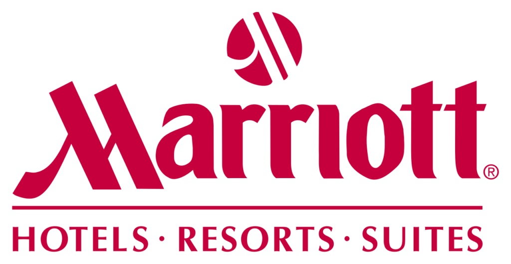
Hospitality written as a signature
Marriott grew from a Washington, D.C. root beer stand opened in 1927 into a global hospitality company. Its visual identity therefore has to balance personal welcome with the reliability of a vast operating system. The best-known Marriott marks do this through a distinctive initial: an “M” that feels drawn rather than engineered.
The heritage script
For decades, Marriott’s red script wordmark gave the brand the warmth of a signature. Its oversized, looping M created an immediate visual hook while the connected lettering suggested service delivered by people rather than an anonymous institution. Red added confidence and visibility across hotel signs, stationery and advertising.
The script also accumulated familiarity as the portfolio expanded. That familiarity was valuable, but a single hotel wordmark could not clearly organize a company containing many different brands, from select-service properties to luxury destinations.
A clearer corporate monogram
The Marriott International identity isolates the memorable M and pairs it with a quieter uppercase name. The monogram preserves the human motion of the earlier signature while the typography below it supplies structure. This creates a useful distinction: the parent company can appear contemporary and orderly without erasing the heritage guests already recognize.
In digital settings, the M performs the work once carried by the full script. It scales into social avatars, app icons and compact navigation while remaining distinctive. The restrained color palette also leaves room for individual hotel brands to keep their own voices.
One company, many guest experiences
Marriott’s identity challenge is architectural. The corporate mark must endorse dozens of brands without making them all look alike. A strong parent monogram supplies trust behind the scenes, while properties such as Ritz-Carlton, W Hotels and Courtyard can preserve their own visual character.
The evolution is therefore not a simple old-logo/new-logo swap. It is a shift from one expressive signature toward a layered brand system. The script speaks like a host signing a welcome note; the monogram behaves like a dependable seal on a global network. Both rely on the same recognizable stroke of the M.
Sources and image notes
Marriott’s official Our Story traces the company from its 1927 family business to its global portfolio; current brand usage is documented across Marriott’s corporate properties. Historical marks are shown for identification, criticism, commentary and education. Marriott and its logos are trademarks of Marriott International, Inc.; LogoEvolve is not affiliated with Marriott.
Marriott’s monogram and wordmark balance property signage with corporate recognition. That challenge is shared by Hilton, while Airbnb approaches hospitality through a single digital-era community symbol.