The chevrons begin with a gear
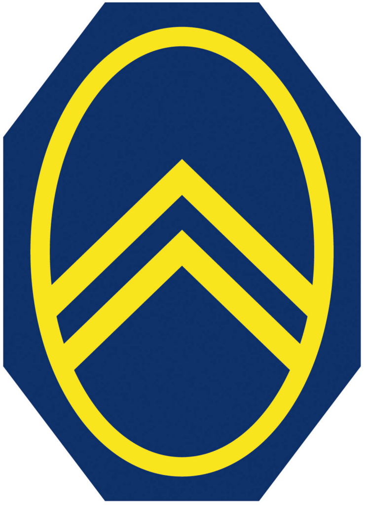
Before building cars, André Citroën manufactured double-helical gears whose angled teeth formed a herringbone pattern. When he founded the automobile company in 1919, two stacked chevrons became the natural signature. The first emblem enclosed them in an oval, turning a piece of engineering into a clear badge.
The symbol survives repeated restyling
Citroën changed color, framing, lettering, and dimensional treatment many times, but the two chevrons remained. Their simple geometry could be stamped into metal, mounted on a radiator, printed in advertising, or enlarged into a grille design. Few automotive marks connect a founder’s earlier trade so directly to the finished identity.
Modern badges emphasize metal and motion
During the late twentieth and early twenty-first centuries, the chevrons escaped the oval and took on chrome depth. The 2009 identity paired polished forms with a red wordmark, presenting Citroën as contemporary and approachable while keeping the mechanical origin visible.
The 2022 redesign closes the historical loop
Citroën described its 2022 mark as the tenth evolution in 103 years. The chevrons returned to a vertical oval inspired by the 1919 badge, but the flat one-color drawing was optimized for digital environments and new vehicle surfaces. The rounded enclosure adds warmth around the precise technical forms.
Heritage becomes a tool, not decoration
The redesign resembles the way Renault recovered an earlier graphic idea for a digital future. Citroën did not recreate the first badge detail for detail. It identified the essential relationship—chevrons inside an oval—and rebuilt it with modern spacing and weight. The result links electric mobility and future products to the same engineering story that began the company.