A founder becomes the identity
KFC’s logo history is inseparable from Harland Sanders. KFC’s official history records that Sanders began serving travelers in Corbin, Kentucky, developed his recipe of eleven herbs and spices, adopted his white suit in 1950, and opened the first Kentucky Fried Chicken franchise in 1952. His appearance became both personal signature and commercial shorthand.
That founder-led identity gives KFC an unusual advantage. Many restaurant marks depend on a food picture or a word alone; KFC can communicate heritage through a recognizable face, glasses, goatee, string tie, and white suit. Even when the drawing style changes, those cues keep the Colonel identifiable.
From Kentucky Fried Chicken to KFC
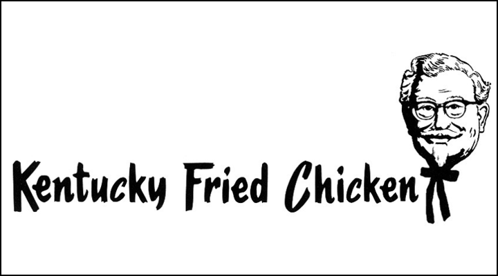
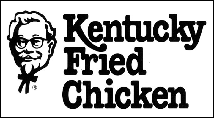
The original name explained the product and place directly, but it was long and difficult to fit into compact formats. As the business expanded internationally, the abbreviated KFC name became a more efficient global signature. Three letters could sit beside the Colonel, appear on a bucket, or fill a storefront sign without losing the association built by the full name.
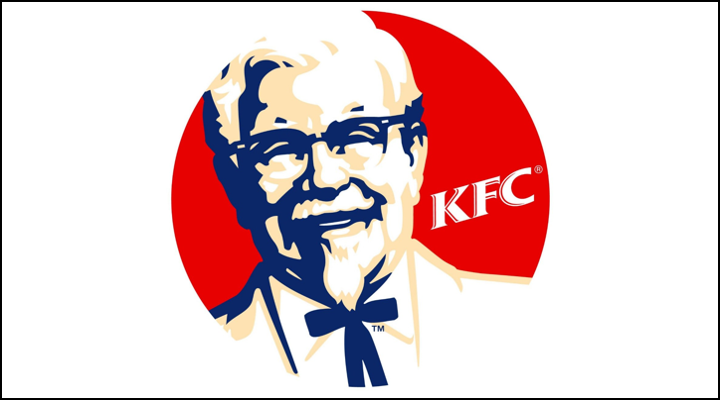
Red gradually became the dominant visual signal. It brings appetite, energy, and visibility, while black-and-white portrait lines preserve the founder’s archival character. The palette also translates cleanly across packaging, restaurant architecture, uniforms, and digital ordering screens.
The Colonel is redrawn, not replaced
KFC’s own history says the company logo adapted over the years while the Colonel’s face remained at the forefront. That is the central logic of the lineage. Illustrators can simplify wrinkles, adjust the glasses, reshape the bow tie, or change the surrounding container, yet the identity remains immediately recognizable.
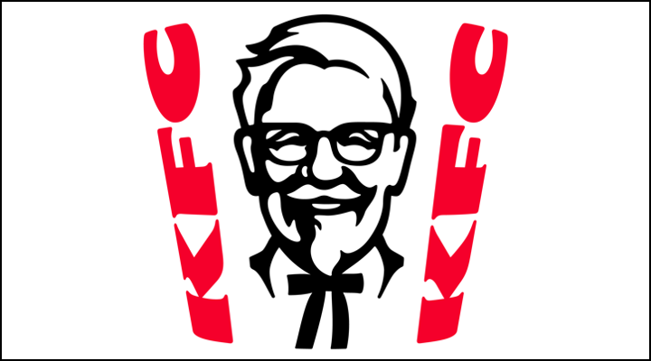
The current primary mark places the portrait inside a bucket-like white field framed by bold red side panels. The container recalls the original KFC bucket introduced in 1957 while producing a strong, nearly square silhouette for apps and signs. The Colonel remains friendly and direct rather than becoming a remote corporate emblem.
Heritage that still works digitally
The present logo is detailed enough to retain personality but simplified enough to reproduce at small sizes. Large black shapes define the face, glasses, hair, and tie. Red supplies the brand block. White negative space keeps the portrait from becoming visually heavy.
Within fast food, KFC’s approach differs from McDonald’s, whose golden arches reduce the brand to architecture-like geometry, and Burger King, whose name is contained inside a food metaphor. KFC instead makes a person the enduring asset—a reminder that the recipe, founder story, and visual identity were designed to reinforce one another.