Rounded letters make breakfast friendly
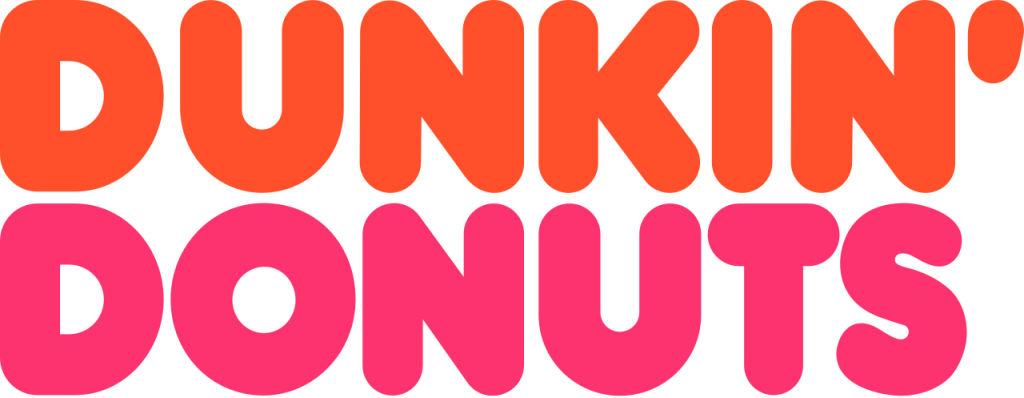
Dunkin’ Donuts developed a cheerful identity around thick rounded lettering and a pink-and-orange palette. The informal typography matched an everyday stop for coffee and baked goods rather than a formal dining experience.
Coffee becomes as important as donuts
As beverage sales grew, cup imagery and coffee-focused messaging joined the wordmark. Customers were already shortening the name in conversation, giving the company a familiar route toward a broader identity.
The brand becomes simply Dunkin’
In 2018 the company announced that stores would adopt the shorter Dunkin’ name beginning in 2019. The apostrophe, colors, and rounded letterforms remained, preserving recognition while removing a product limitation.
The shortened name can be compared with KFC and Subway, restaurant identities that became more compact as familiarity increased.