eBay logo history captures a company moving from internet novelty to global commerce platform. Pierre Omidyar launched AuctionWeb in 1995, creating a marketplace where individuals could trade directly. The service adopted the eBay name in 1997, and its best-known early wordmark arrived near the end of the decade.
Why the old eBay logo looked so unruly
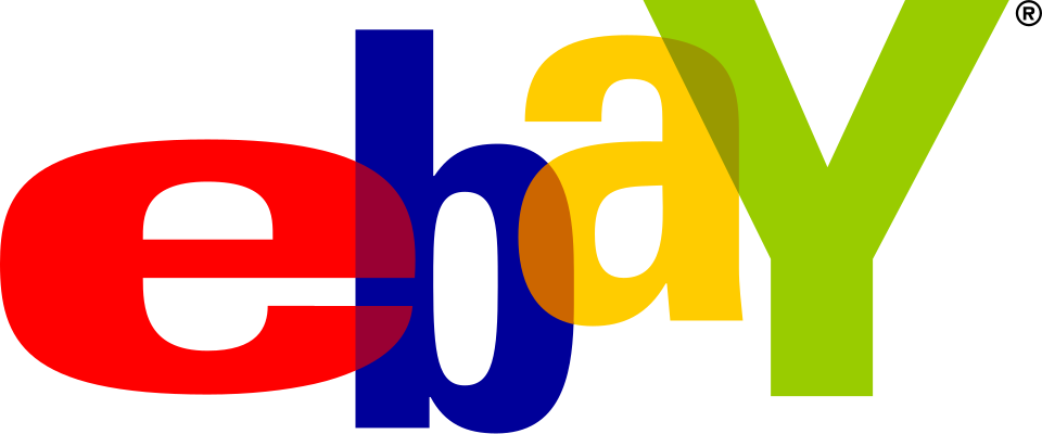
The 1999 wordmark used differently sized letters that overlapped and bounced above and below a common baseline. Red, blue, yellow and green amplified the sense of variety. It felt less like a conventional retailer and more like a table covered with surprising objects from thousands of sellers.
That apparent disorder was useful storytelling. eBay did not own a uniform inventory or control every listing presentation; its value came from people, discovery and enormous range. The tangled letters suggested connection, while their mismatched scale made the marketplace feel open and slightly unpredictable.
A logo born for the dot-com era
The mark also fit its moment. Many early internet brands rejected the sober visual language of banks and department stores. Bright color and informal composition communicated that the web offered a different kind of experience. For eBay, this personality became powerful recognition during rapid international growth.
But the qualities that made the logo energetic could also make it difficult to organize. As eBay expanded into mobile commerce, payments, structured retail categories and professional selling, the company needed an identity that felt dependable without erasing its history.
The 2012 redesign
The redesign unveiled in 2012 kept the lowercase name and its four-color sequence but changed almost everything about the letters’ behavior. They became slimmer, more consistent and aligned on a shared baseline. The overlap disappeared, leaving controlled spacing and a calmer silhouette.
This was a smart conservation strategy. Color carried recognition from the old system into the new one, while alignment communicated a more mature platform. The wordmark could sit comfortably in an app, a checkout flow or a corporate announcement without looking like a relic of the late 1990s.
What changed—and what survived
- Structure: overlapping letters became an orderly horizontal wordmark.
- Typography: eccentric scale gave way to lighter, consistent forms.
- Color: red, blue, yellow and green preserved instant recognition.
- Voice: playful discovery matured into accessible global commerce.
eBay’s current mark works because it does not pretend the company has become colorless or generic. It still carries the optimism of the original marketplace, just with enough discipline for a service handling high-value transactions, established businesses and millions of eBay marketplace interactions.
The lineage is a concise example of brand evolution: keep the one element audiences remember most, then redesign the system around the company you have become.
Explore today’s eBay marketplace
From collectibles and vintage finds to current technology, the marketplace still reflects the variety expressed by its famous multicolor identity.
Shop on eBay →
LogoEvolve presents this history for editorial and educational purposes. eBay and its marks belong to their respective owner.
Affiliate disclosure: This page contains paid affiliate links. LogoEvolve may earn a commission from qualifying purchases at no additional cost to you.
document.addEventListener(“DOMContentLoaded”,function(){var m=document.querySelector(“main”),c=m&&m.querySelector(“.le-affiliate-cta”),h=m&&m.querySelector(“h1”),p=h&&h.nextElementSibling;if(c&&p){p.insertAdjacentElement(“afterend”,c);}});
eBay’s aligned 2012 wordmark became calmer without losing its marketplace color sequence. Its evolution sits naturally beside Amazon’s smile-led identity and Walmart’s increasingly digital retail system.
The PayPal logo history traces the visual evolution of a payments brand closely connected to eBay’s growth.
Continue comparing related identity systems with Etsy.