The roof turns a building into a symbol
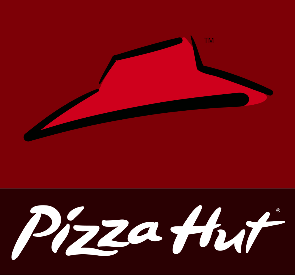
Pizza Hut’s most durable asset is the red roof inspired by its restaurant architecture. Paired with loose, hand-drawn lettering, it created a friendly roadside identity that worked on signs, boxes, and television.
Global expansion adds polish
Later designs introduced cleaner typography, dimensional highlights, and swooping shapes. These versions aimed for consistency across many markets while preserving enough of the roof silhouette to maintain recognition.
Heritage returns in 2019
Pizza Hut revived a circular red lockup based on its celebrated 1970s and 1980s identity. The flat white roof and name sit inside a solid disc, making the brand feel both nostalgic and well suited to delivery apps.
The return to a classic restaurant asset parallels Burger King and KFC, which also rediscovered the strength of simpler historical forms.