More than a century of rewriting refreshment
Pepsi’s logo has changed more often—and more dramatically—than many brands of comparable age. Its history begins with a pharmacist’s ornate signature, becomes a patriotic bottle cap, turns into a modernist globe, breaks apart into symbol and word, and finally reunites them in a design that deliberately revives its own past. The constant is not one typeface or layout. It is Pepsi’s instinct to look unmistakably of the moment.
1898–1940: the age of the script
Pharmacist Caleb Bradham renamed “Brad’s Drink” Pepsi-Cola on August 28, 1898, in New Bern, North Carolina. The earliest identity was an elaborate red script with loops, swashes and a hand-drawn quality typical of turn-of-the-century beverage branding. The logo behaved like a maker’s signature, emphasizing the product name before Pepsi possessed a separate visual symbol.
Successive script versions improved legibility and organization. The 1906 mark opened the letterforms and incorporated messaging around the name; by 1940, the script was cleaner, heavier and more controlled. Across these changes, red remained central and “Pepsi-Cola” remained inseparable. The brand was refining a signature rather than reinventing its visual category.
1950: the bottle cap establishes the palette
The 1950 bottle-cap identity was the structural breakthrough. Red, white and blue waves wrapped around the cap while the familiar script crossed its center. Packaging became the logo: the crown cap’s circular shape created a badge that was instantly connected to the physical act of opening a cola.
This is where Pepsi’s enduring color architecture became unmistakable. The palette offered powerful shelf contrast and a recognizably American character in the postwar period. More importantly, it gave Pepsi an asset beyond lettering. The red-and-blue circle could continue to evolve even when the script eventually disappeared.
1969–1991: from cap to modernist globe
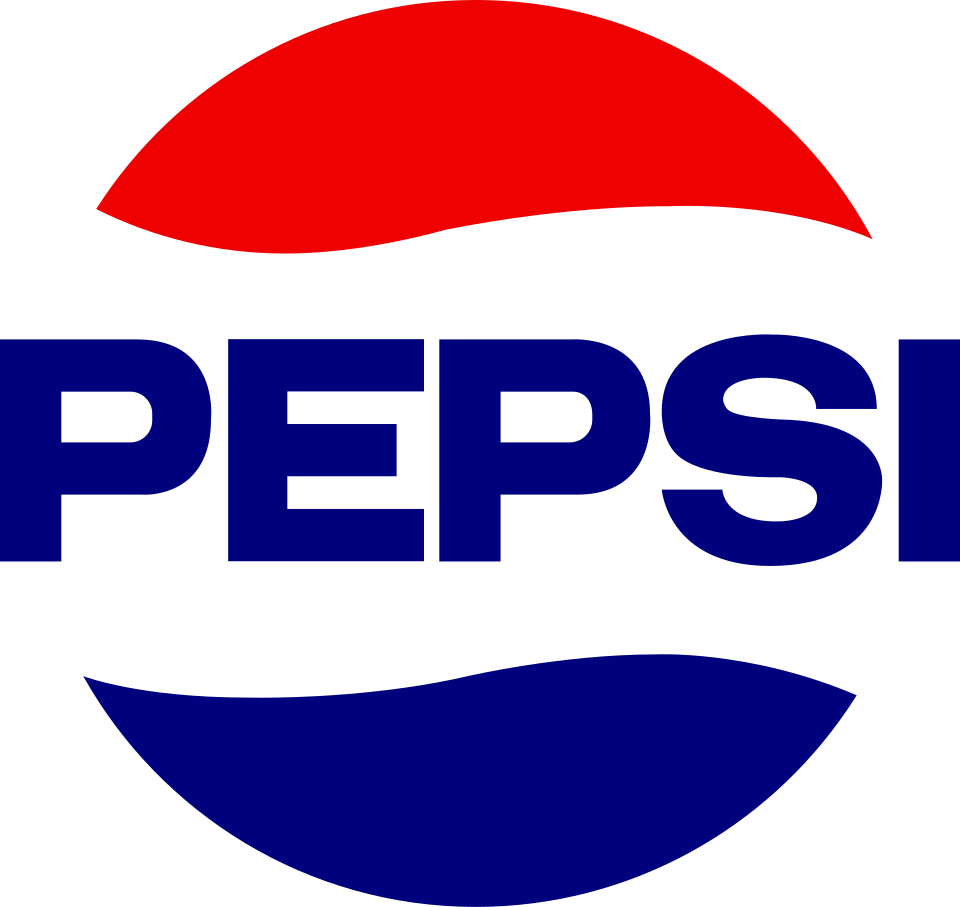
By 1969, Pepsi had dropped “Cola” from the primary name and replaced the old script with assertive block lettering. The cap was simplified into the Pepsi globe: a flat circle divided by a white wave, with red above and blue below. The identity moved from pharmacy heritage to mass-market modernity.
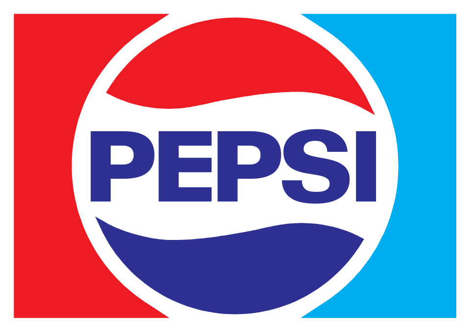
The 1973 system placed the globe inside a compact rectangular lockup with the wordmark running through the center. Strong geometry made it work across cans, coolers, signs and advertising. It was direct, reproducible and culturally aligned with a brand positioning itself as the energetic challenger.
1991: symbol and name separate
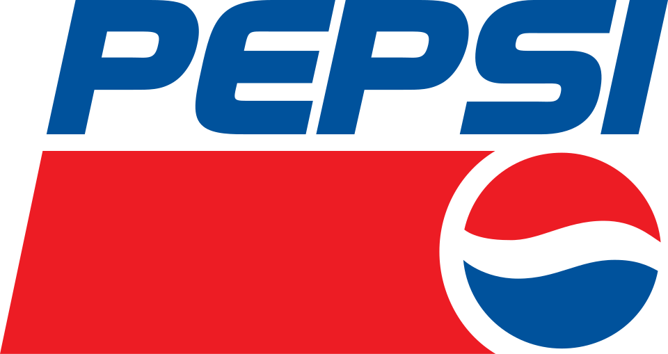
In 1991, the wordmark moved away from the globe and took on an italic angle. A red bar underlined the name while the globe occupied its own space, creating a layered composition that suggested speed. The pieces could now operate independently, giving Pepsi more flexibility across sponsorships and entertainment-driven marketing.
That freedom also began an era of increasing surface effects. During the 1990s and 2000s, the globe gained highlights, gradients and dimensional treatments suited to glossy packaging and screen graphics. The underlying red-white-blue structure survived, but it was repeatedly styled to match contemporary expectations.
2008: the globe becomes a smile
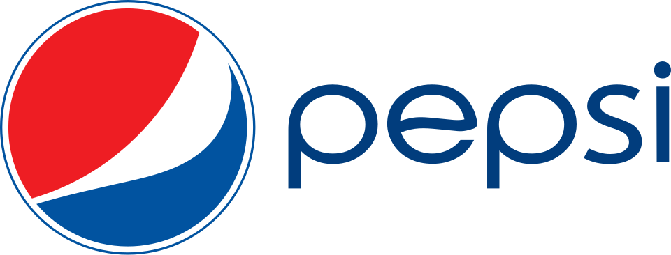
The 2008 redesign separated a lowercase wordmark from a radically altered globe. Its white band became asymmetrical, changing width as it crossed the circle and creating the impression of a smile. Lowercase typography made the name more casual, while the symbol’s surface treatment varied across products.
This identity was minimal in layout but conceptually elaborate. The globe no longer behaved like a stable flag or badge; it became expressive. It also placed significant distance between Pepsi’s name and its most recognizable symbol—a decision the company would explicitly reconsider fourteen years later.
2023: the name returns to the globe
Pepsi unveiled its current identity on March 28, 2023, ahead of the brand’s 125th anniversary. The company described it as the first update to the globe in fourteen years and a deliberate combination of historical equity with contemporary elements. North American rollout began that fall, followed by a global launch across more than 120 markets in 2024.
The bold uppercase name once again sits inside the globe, recalling the confident lockups of the 1970s and 1980s without reproducing them literally. Electric blue sharpens the classic palette, while black adds contrast and connects the master identity to Pepsi Zero Sugar. A custom typeface makes the name compact and forceful.
The surrounding system is built for motion. Pepsi’s “pulse” graphic evokes ripple, pop and fizz while also borrowing the rhythm of music and live culture. That lets the identity move between a can, a stadium display, a digital animation and a fashion collaboration without relying on a static logo alone.
One piece of research behind the redesign is especially revealing: Pepsi said that when people around the world were asked to draw its logo, most placed the name inside the globe—even though the official identity had separated them for fourteen years. The 2023 design responded to remembered brand equity, not just internal taste. It restored the configuration many people already believed Pepsi had.
What the evolution reveals
Pepsi’s identity is a pendulum between heritage and novelty. The scripts stressed origin and craft. The bottle cap created a durable symbol. Modernist systems simplified it; later decades added dimension and motion; 2008 pulled the pieces apart; 2023 brought them back together.
The newest logo works because it recognizes that progress does not always require visual amnesia. Its strongest idea is borrowed from Pepsi’s own history: name and globe become one concentrated badge. Modern color, type and motion then give that familiar arrangement a new job. After 125 years of change, Pepsi evolved by remembering what people had never quite forgotten.
Sources and image notes
The founding date and current redesign rationale come from PepsiCo’s official 125th-anniversary history, its 2023 identity announcement, the PepsiCo Design case study, and the official 2024 global rollout account. Historical renderings are presented for editorial comparison and sourced from the Wikimedia Commons Pepsi archive. Pepsi and its logos are trademarks of PepsiCo, Inc.; LogoEvolve is not affiliated with or endorsed by PepsiCo.
Pepsi repeatedly reinterpreted its globe to signal the present, in contrast with Coca-Cola’s reliance on historic script. Together they show two opposite ways to maintain recognition in the same category. Pepsi’s changing globe can also be read beside Starbucks’s steadily simplified siren, another beverage mark designed to work without its full name.
See how another major brand in the PepsiCo family evolved in Lay’s logo history.






.svg)


.svg)