A corporate name shaped into a globe
IBM’s logo history begins before the initials became famous. In 1911, three businesses merged into the Computing-Tabulating-Recording Company, commonly called C-T-R. The combined company sold scales, clocks, punch-card equipment, and other machines, so its first identity used ornate interlocking letters rather than the compact technology mark recognized today.
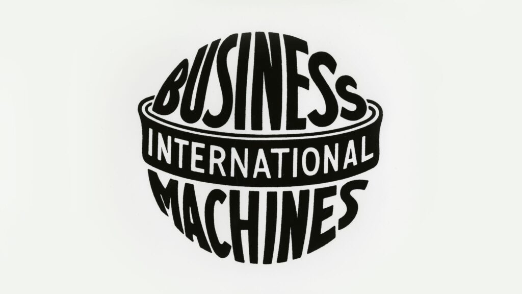
The company adopted the name International Business Machines in 1924. Its new emblem literally wrapped the words around a globe: “Business Machines” formed the body while “International” crossed the center. IBM’s official history explains that the Art Deco construction expressed modern machinery and the company’s growing global ambition. It was descriptive and symbolic, but too detailed for the faster, simpler communications that followed.
The initials replace the globe
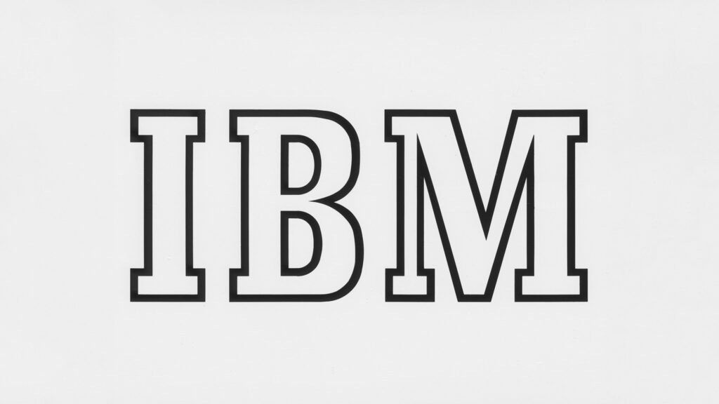
In 1947, the globe disappeared and the initials IBM took over. The outlined Beton Bold letters debuted on the company magazine Business Machines. The shift coincided with IBM’s movement from punched-card tabulating equipment toward electronic computing. Instead of explaining the full corporate name, the identity trusted three initials to carry the brand.
That 1947 mark was simpler than the globe, yet its outlined construction still felt relatively light and decorative. As IBM entered a new period of growth, leadership wanted a more stable expression of continuity, modernity, and engineering authority.
Paul Rand makes IBM solid
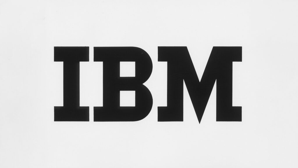
Thomas J. Watson Jr. hired designer Paul Rand in 1956. Rand replaced the older type with City Medium, giving the letters heavier slab serifs and more balanced proportions. IBM’s official account points to details such as the square forms in the B and the asymmetrical serifs of the M. The result looked grounded, industrial, and confident without abandoning the initials customers already knew.
This approach resembles the long simplification of Intel: both technology companies reduced a complex corporate story to a distinctive typographic signature. IBM, however, kept strong slab serifs while Intel moved toward increasingly neutral geometry.
The striped logo suggests speed and continuity
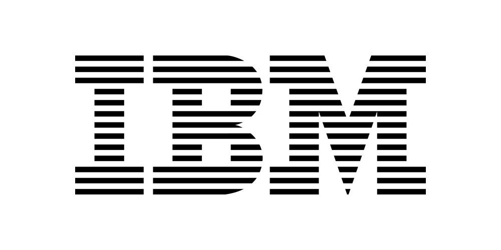
Rand returned to the identity in 1972. He divided the letters into horizontal bands—most famously eight bars, with a 13-bar version also used. The stripes preserved the silhouette of the 1956 wordmark while making it feel more dynamic. IBM describes the design as streamlined, and the repeated lines can suggest scanning, movement, data, and continuous connection without illustrating any one product.
The striped mark proved exceptionally durable. It could appear in IBM blue, black, white, or gray; scale from hardware labels to buildings; and remain identifiable even when new businesses changed what IBM actually sold. Unlike technology identities that require regular stylistic reinvention, the basic 8-bar construction has remained unchanged since 1972.
A system flexible enough for serious and playful uses
In 1981, Rand created the Eye-Bee-M rebus poster, replacing the first two letters with pictures of an eye and a bee. It did not replace the corporate logo, but it showed how a disciplined identity could support wit. The rebus remains part of IBM’s visual heritage and entered the Museum of Modern Art’s collection.
Today the 8-bar logo operates as both corporate signature and design artifact. IBM’s current guidelines carefully control stripe weight, spacing, distortion, outlines, and surrounding shapes. Those rules protect the optical balance that makes the mark appear simple. The lineage demonstrates a valuable pattern: the company changed from mechanical record keeping to computing, software, services, cloud systems, and artificial intelligence while one carefully engineered wordmark continued to represent it.