From a software startup to a universal technology brand
Microsoft’s logo history reads like a compressed history of the personal-computing industry. The earliest marks feel experimental and culturally specific: one looks like it belongs on a 1970s record sleeve, another could have been stamped onto a piece of futuristic hardware. As Microsoft grew from a small software company into a defining force in business and home computing, its identity became progressively calmer, clearer and easier to reproduce. The 2012 design completed that journey by adding a symbol built for screens, apps and a family of products rather than a single corporate wordmark.
1975: a name built from two ideas
The original logo makes the construction of the company’s name unusually visible. “Micro-Soft” joined microcomputer and software, and the striped letterforms gave that young technical idea the visual energy of its decade. Microsoft’s official history traces the business to Bill Gates and Paul Allen’s work selling BASIC to MITS in Albuquerque, while the company’s 50th-anniversary materials identify this as the original mark used from 1975 to 1980.
Its concentric, tightly packed lines are memorable, but they are also complicated. At small sizes the gaps can collapse, and the style ties the company strongly to one moment in graphic fashion. That was not necessarily a flaw for a startup trying to look new. It became a limitation once Microsoft needed an identity that could travel across packaging, manuals, advertisements and an expanding catalog.
1980: sharper, louder and closer to hardware
The 1980 redesign is the outlier in Microsoft’s lineage—and that is precisely why it is so compelling. The wide, angular capitals replace the rounded rhythm of the first logo with something harder and more mechanical. The exaggerated diagonals and extended strokes imply speed, circuitry and heavy metal typography. Microsoft was entering a new phase in which its name would increasingly appear beside computer hardware and commercial software, and the mark projected confidence rather than garage-era experimentation.
This identity was short-lived. Its personality is enormous, but its irregular shapes make it less neutral and less adaptable than the wordmarks that followed. Microsoft did not need to abandon character; it needed a mark that could support a rapidly broadening company without competing with every product name placed near it.
1982: the “Blibbet” brings order
On June 28, 1982, Microsoft officially announced a new corporate logo alongside new packaging and a comprehensive program of retail-dealer materials. The company’s historical record calls the striped character inside the first “O” the “Blibbet.” The rest of the wordmark is sober and highly legible, so that small circular device becomes the memorable signature.
This was more than a cosmetic cleanup. A coordinated logo, packaging system and dealer-support program signals a company thinking systematically about how it appears in the market. The Blibbet kept a hint of the line work from 1975, but contained it inside a disciplined wordmark. It balanced continuity with maturity: recognizably a technology company, yet credible enough for a growing international business.
1987: the Pac-Man cut and a 25-year run
The decisive move came on February 26, 1987. Microsoft introduced a total redesign of its corporate materials led by a new logo that became known as the “Pac-Man” mark. Designer Scott Baker described the result as simple, clean and uncluttered. Set in italic Helvetica, it included a distinctive slash between the “o” and “s.” Microsoft’s own account says the cut emphasized the “soft” half of the name while conveying motion and speed.
That tiny subtraction did an extraordinary amount of work. Without a separate icon, it gave an otherwise restrained wordmark a proprietary detail. The italic angle carried momentum, while the heavy lowercase lettering remained readable on software boxes, startup screens, building signs and corporate documents. Unlike the rapidly changing first twelve years, this identity lasted for a quarter century. Its longevity mirrors the period in which Microsoft became a household name through DOS, Windows and Office.
2012: one system, four squares
Microsoft unveiled its current identity on August 23, 2012, calling it the company’s first logo update in 25 years. The timing was deliberate. Windows 8, Windows Phone 8, a new Xbox experience and a new version of Office were all approaching, and Microsoft wanted those products to feel like parts of one connected visual system.
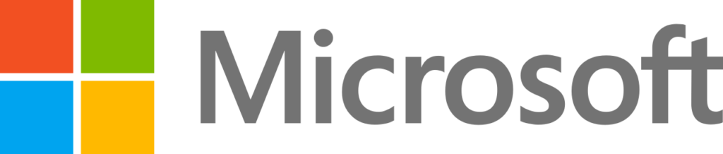
The new mark paired a gray Segoe wordmark with four colored squares. Microsoft explained that Segoe was already used across its products and marketing, while the symbol’s colored tiles expressed the company’s diverse product portfolio. The geometry also works naturally in digital environments: the square can become an app tile, a window, a grid or a compact icon, and it can animate without losing recognition.
The change traded the Pac-Man wordmark’s typographic quirk for a much more flexible architecture. The symbol and name can work together, while the symbol can also stand on its own. The red, green, blue and yellow add warmth and product-level variety without making the wordmark itself noisy. It is a corporate identity designed less like a signature and more like a platform.
What the evolution reveals
Across five eras, Microsoft moved from expressive lettering to an adaptable system. The first three marks searched for the right personality. The 1987 design found a durable corporate voice. The 2012 identity then expanded that voice into a visual language capable of linking software, devices, services and physical spaces.
The most successful transitions did not erase the company’s past; they translated what Microsoft needed at a new scale. The Blibbet disciplined the original stripes. The Pac-Man cut turned a straightforward wordmark into a recognizable asset. The four-square symbol transformed the idea of a window—and, more broadly, a modular digital interface—into a compact corporate emblem. The result is a lineage shaped not only by graphic taste, but by changing technology and the changing job the logo had to perform.
Sources and image notes
The historical dates and corporate explanations above draw primarily from Microsoft’s official 1975 history, 1982 history, 1987 history, 2012 logo announcement, and 50th-anniversary archive. Historical logo renderings are presented for editorial identification and comparison, sourced from the Wikimedia Commons Microsoft logo archive. Microsoft and its logos are trademarks of Microsoft Corporation; LogoEvolve is not affiliated with or endorsed by Microsoft.
Microsoft’s identity moved from expressive software-era wordmarks toward a modular window built for a broad platform. Compare that trajectory with Apple’s standalone symbol and Google’s responsive multicolor system.
LinkedIn shows how a Microsoft-owned professional platform preserves a distinct boxed-in monogram and blue identity. Explore the LinkedIn logo history.
Continue comparing related identity systems with GitHub.







.svg)