A service-station symbol becomes the company name
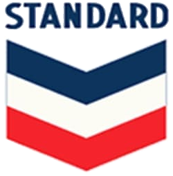
Chevron began as Pacific Coast Oil Company in 1879 and later became Standard Oil Company of California, commonly shortened to Socal. The company’s official history dates the first chevron-shaped hallmark to 1931, when it was introduced across roughly 900 West Coast service stations. The repeated V-shaped form created a consistent roadside identifier before Chevron became the corporate name.
The earliest hallmark carried more words and framing than today’s mark. That made sense in an era when the sign had to explain the relationship between Standard Oil, California operations, gasoline, and service. The central geometry nevertheless established the feature that would outlast every surrounding label.
The hallmark is modernized for a wider world
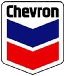
Chevron’s official timeline records a modernized hallmark in 1969, designed to communicate the company’s identity worldwide. The red-and-blue stacked chevrons became bolder and more independent, while the name moved into a clearer relationship with the symbol. The result was recognizable at filling-station scale and flexible enough for corporate communications.
In 1984 Standard Oil Company of California changed its corporate name to Chevron Corporation, aligning the company with the brand customers already saw. The symbol had effectively become strong enough to rename the organization behind it.
Warmth and momentum replace rigid geometry
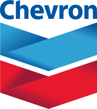
After the ChevronTexaco period, the company returned to the Chevron name in 2005 and introduced a more approachable hallmark. Softer gradients and gently curved bands retained the red-over-blue order while suggesting motion. Chevron’s history describes the redesign as building on heritage while communicating warmth and momentum.
A further 2019 refinement connected the hallmark to the company’s “human energy” idea. The recognizable stacked V construction remained. This continuity separates Chevron from the sharper identity break seen at BP, whose 2000 Helios replaced the shield with a sun-and-flower form, while still showing the same industry pressure to communicate energy in broader terms.
Why the double chevron remains useful
The symbol succeeds at several distances. From the road, the red and blue bands make a distinctive block of color. Up close, the curves and gradients add dimension. In a small digital setting, the two nested V shapes remain readable even when fine details disappear.
Chevron’s lineage demonstrates how a retail sign can grow into a corporate identity. The company simplified the words around the emblem, expanded the meaning of the name, and adjusted the tone of the artwork without abandoning the visual device introduced in 1931.
Chevron’s stacked chevrons retain an unusually stable corporate structure. Compare that continuity with Shell’s progressively simplified pictorial emblem and BP’s wholesale move from shield to Helios.