A corporate identity formed by convergence
ExxonMobil’s visual history is not a straight sequence of replacements made by one company. It is the meeting point of several identities descended from Standard Oil. The company’s official history traces roots through Jersey Standard, Socony, Vacuum Oil, Esso, Exxon, Mobil, and the Pegasus symbol. When Exxon and Mobil joined in 1999, the new corporate name had to make that complicated inheritance feel immediate and unified.
This distinction matters when reading the logo. ExxonMobil did not invent a new abstract emblem to announce the merger. It combined two already familiar names into a single red wordmark. The decision emphasized continuity: customers, employees, investors, and markets could see both predecessor companies in the new organization.
Standard Oil creates a family of marks
Standard Oil was formed in 1870, and the later breakup of the trust in 1911 produced multiple independent companies. Two important branches were Standard Oil Company of New Jersey, often called Jersey Standard, and Standard Oil Company of New York, or Socony. Vacuum Oil brought its own lubricant history and the Mobilgas name. Over time, these businesses built identities for different products and regions rather than one universal badge.
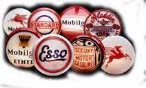
That is why the official ExxonMobil historical material looks like a constellation: circular gasoline signs, wordmarks, shield-like emblems, and the flying red Pegasus appear together. These marks were designed for service stations, pumps, cans, trucks, and road visibility. Bold borders and simple color contrasts helped drivers recognize a brand quickly in a crowded roadside environment.
Esso turns initials into a name
Jersey Standard introduced Esso in 1926. The name rendered the initials “S” and “O” phonetically, preserving a verbal connection to Standard Oil while creating a compact brand that could be spoken and remembered. The familiar red Esso lettering inside a blue oval became especially durable and remains in use in a number of markets.
Esso demonstrates how naming can solve a legal and geographic identity problem. Rather than describe a product, it translated corporate ancestry into a distinctive sound. Its oval enclosure also worked exceptionally well on pumps and round roadside signs, where the mark needed to remain legible at speed.
Mobil pairs modern type with a red “o”
Socony and Vacuum merged in 1931, bringing the Pegasus and Mobilgas histories together. In 1966, the company simplified its name to Mobil Oil Corporation and introduced a broad identity program centered on Mobil. The resulting wordmark used clean blue lettering with a red “o,” turning one character into a memorable point of emphasis.
The Mobil identity was quieter than the illustrated Pegasus, but much easier to deploy consistently across an international corporation. It could sit on a service-station canopy, a lubricant package, a tanker, or a business document without changing its basic behavior. The red “o” added recognition without requiring a separate pictorial symbol.
Exxon provides the other half of the merger
Jersey Standard officially became Exxon Corporation in 1972. The newly coined name avoided the regional restrictions surrounding Standard Oil naming and gave the company a consistent identity in the United States. Its doubled “x” produced a distinctive letter pattern, and the red wordmark carried the confidence and visibility expected of a major fuel brand.
By the time Exxon and Mobil merged on November 30, 1999, both names had accumulated decades of recognition. Eliminating either one would have discarded meaningful equity. Combining them offered a direct statement about the new company’s structure while keeping the identity readable.
Why the ExxonMobil wordmark works
The current logo joins Exxon and Mobil without a space in a single red signature. Capital letters separate the two names conceptually, while the shared baseline and color make them operate as one unit. The design does not attempt to reconcile every predecessor emblem; instead, it resolves the merger at the level of language.
That approach differs from the symbol-led identities used by Shell and BP. Shell can often communicate through the scallop alone, and BP centers its modern identity on the Helios. ExxonMobil relies more heavily on the proprietary shape and rhythm of its name. The wordmark is the symbol.
What the logo communicates today
The identity is deliberately restrained for a corporation operating across fuels, lubricants, chemicals, technology, and large industrial projects. Red provides continuity with both Exxon and important parts of the Mobil heritage, while the absence of a surrounding badge allows the name to function across physical and digital settings.
Its greatest strength is historical honesty. The logo does not mask the 1999 combination with an unrelated new icon. It preserves two recognizable businesses and makes their union visible every time the name appears. Behind that simple wordmark sits a much larger archive of signs, animals, ovals, and product brands—evidence that simplification can carry history without displaying every chapter at once.