A name designed to move
PUMA’s identity began with a useful strategic idea: the company name and symbol should express the qualities athletes wanted to possess. Rudolf Dassler initially registered his new shoe business in 1948, and the PUMA name followed later that year. The company’s official timeline explains that the animal represented speed, strength, endurance, and agility. Those associations gave the young manufacturer something more memorable than a founder’s surname alone.
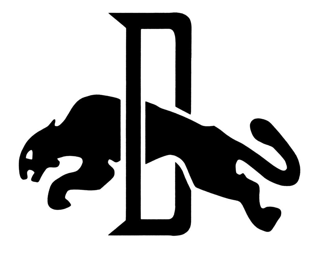
The earliest emblem was denser than the mark people know today. It combined the company name, a letterform, and a cat in one compact construction. That complexity made sense for a factory-era badge, where an emblem could carry several pieces of identity at once. It also established the central metaphor that would survive every later simplification: PUMA was not merely a label attached to a shoe; it was an image of controlled movement.
Why 1968 changed everything
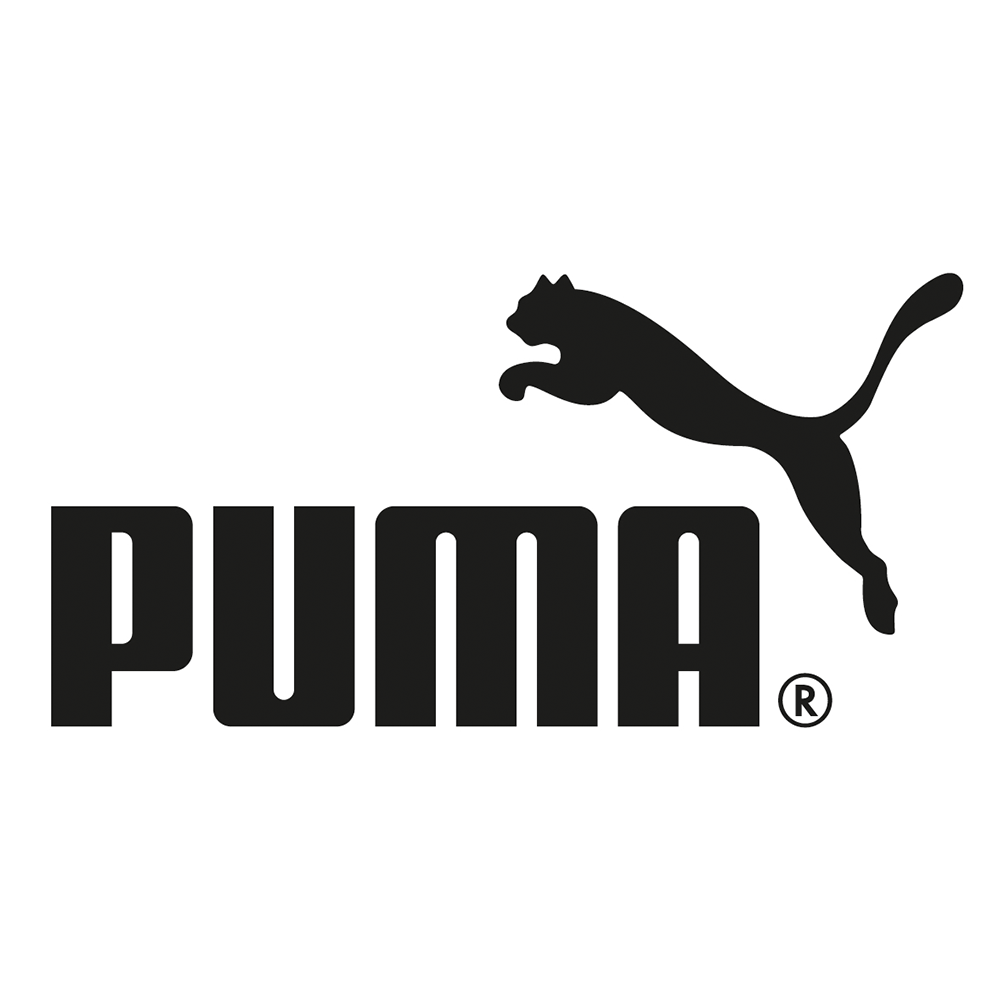
In 1968, PUMA presented the cat logo and the beginnings of what it calls the “No. 1 Logo.” This was the decisive move from an enclosed company badge toward a flexible modern brand system. The cat no longer needed a surrounding device to explain itself. Caught in mid-leap, it provided direction, energy, and an instantly readable silhouette.
The accompanying wordmark does a different job. Its broad uppercase letters feel planted and stable, giving the airborne animal something visually solid to push against. That contrast is a large part of the logo’s effectiveness: the type communicates confidence while the cat supplies speed. Either element can work alone, but together they form a clear signature that remains legible at stadium scale and on the side of a small shoe.
A system built for products and people
Sportswear identities face an unusual test. They must work in advertising, but they also become physical parts of products. A logo may be stitched, molded, printed, repeated as a pattern, or seen in motion on an athlete. PUMA’s simplified cat is well suited to those conditions because its meaning does not depend on fine detail or a long line of text.
The brand also uses the Formstrip on footwear and apparel. Although the Formstrip is a product design element rather than the corporate logo shown in this lineage, it demonstrates the same visual principle: recognition can be built through a repeatable shape. Together, the wordmark, cat, and Formstrip give PUMA several levels of identification without requiring every product to carry the entire lockup.
How PUMA differs from its closest peers
Within sportswear, PUMA’s animal symbol occupies a distinct position beside the abstract marks used by Nike and the geometric systems associated with Adidas. The leaping cat is representational, yet it remains simple enough to behave like an abstract silhouette at small sizes. That balance lets it communicate a specific personality without sacrificing versatility.
The modern identity succeeds because it did not discard the company’s founding metaphor. Instead, it removed the visual machinery around that metaphor. The result is a lineage defined less by reinvention than by concentration: a complicated early badge gradually gives way to the one image that carried the greatest energy all along.
What the logo communicates today
Today’s PUMA mark is direct, athletic, and highly adaptable. Its black-and-white form avoids dependence on a single color environment, while the asymmetrical leap makes the composition feel active even when it is standing still. The logo can appear serious in corporate communication, aggressive in performance sport, or playful in fashion collaborations without losing its identity.
That range explains the longevity of the 1968 concept. The logo does not attempt to illustrate a shoe or describe a particular sport. It expresses a quality—forward motion—that can travel with the company as products, athletes, and audiences change.
For another identity comparison, explore the ASICS logo history.