2004—2009
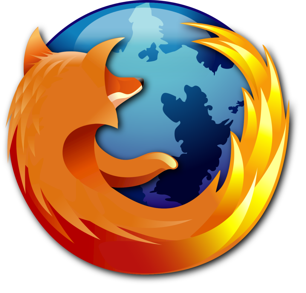
The fox circles the globe
Jon Hicks transformed the product name into a vivid illustration of a fiery fox embracing the world.
Official source: Mozilla brand history


Brand at a glance
Four browser icons trace how Firefox turned a detailed fox and globe into a flexible, fiery symbol without losing its independent character.
Jon Hicks transformed the product name into a vivid illustration of a fiery fox embracing the world.
Official source: Mozilla brand history
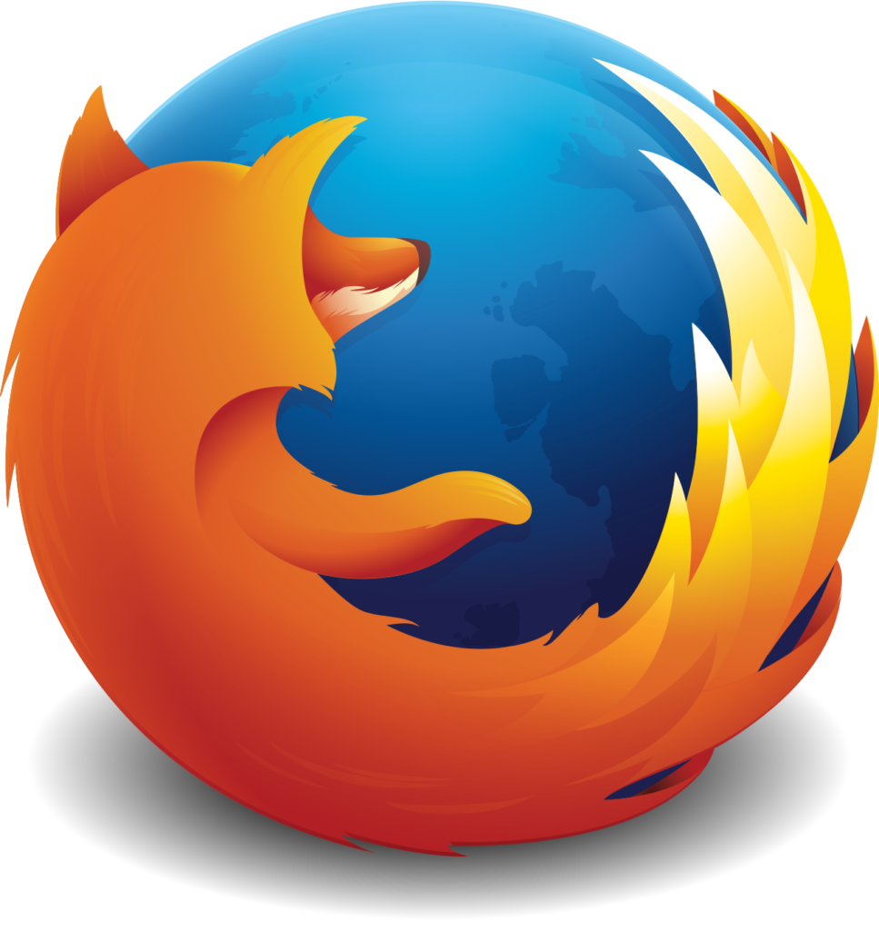
Sean Martell simplified highlights, continents and small details while protecting the circular composition and warm-cool contrast.

Bold Photon colors and a more flame-like tail expressed a faster, more elemental Firefox while retaining the fox and globe.
Official source: Mozilla - A new Firefox icon
Flowing gradients and simplified masses updated the browser icon while a separate parent mark connected Firefox privacy products.
Official source: Mozilla - Evolution of a Brand
Firefox’s logo has always performed an unusually demanding task: it must be distinctive on a desktop, legible as a tiny app icon and expressive enough to represent an alternative vision of the web. Its famous fox-and-globe composition has moved from detailed illustration toward elemental color and motion without losing its central character.
The first Firefox browser logo was designed by Jon Hicks. A fiery fox wraps around a blue globe, turning the product name into a compact visual narrative. The illustration communicated speed, reach and energy while separating the new browser from the abstract corporate symbols around it.
Detail helped the early icon feel crafted and premium, but tiny feathers, highlights and continents also reflected an era of larger desktop icons. As Firefox moved across platforms and higher-density screens, those details became candidates for simplification.
The 2009 era intensified depth and color, giving the globe glassy volume and the fox richer shading. By 2013, Sean Martell’s refinement removed smaller details, simplified the continents and clarified the silhouette. The identity retained its familiar story while becoming more reproducible.
This gradual editing is why Firefox remained recognizable through repeated redraws. The team protected the circular embrace, the diagonal movement of the tail and the warm-versus-cool color contrast. Surface styling could change because the composition stayed stable.
Firefox Quantum brought a faster browser and a new Photon design language. Mozilla described the revised tail as more flame-like and the creature as more mythical than literal. Bold color and simplified shapes conveyed the scale of the product changes without abandoning the fox or globe.
In 2019 Mozilla introduced a parent brand for a family of Firefox products and separately updated the browser icon. The distinction caused lasting confusion: the fiery parent-brand mark was repeatedly mistaken for a fox-free browser logo. Mozilla later clarified that the fox remained—and said it had no plans to remove it.
The browser icon now uses flowing gradients and larger, simpler masses. The globe becomes a purple core rather than a map, while the fox reads as a ring of flame in motion. The broader system adds a palette, typography, shapes and accessibility standards designed to connect multiple privacy-focused services.
Firefox’s evolution is simplification with a reason. Each redraw helps the icon function in smaller, faster and more varied contexts, but recognition depends on preserving character. The fox is not decoration pasted onto the browser; it is the emotional counterweight to software infrastructure—clever, independent and alive.
That explains the intensity of public reaction when people believed it had vanished. Users were not defending individual tufts of fur. They were defending the personality and values accumulated around the silhouette. Firefox can keep evolving, but its audience has made clear which part of the story it considers sacred.
Mozilla’s official accounts of the 2017 Quantum icon, the 2019 brand system, and its clarification that the fox remains provide the design rationale. Historical renderings are presented for identification, criticism, commentary and education. Firefox and its logos are trademarks of the Mozilla Foundation; LogoEvolve is not affiliated with Mozilla.
Firefox’s identity remains unusually illustrative for a technology brand. Compare its evolving globe-and-animal emblem with the typography-led systems of Google and Microsoft.
Continue through the open-web family with Mozilla’s logo history and its related visual identity.
 GitHub
A sturdy wordmark and the Octocat family turned code collaboration into a recognizable developer brand.
GitHub
A sturdy wordmark and the Octocat family turned code collaboration into a recognizable developer brand.
 Google
Technology company best known for search, advertising, software, and online services.
Google
Technology company best known for search, advertising, software, and online services.
 HP
Two lowercase initials survived decades of technology change by staying inside a flexible circle.
HP
Two lowercase initials survived decades of technology change by staying inside a flexible circle.
