The signature that refused to become anonymous
Coca-Cola’s logo history is unusual because its most important decision happened almost immediately. The brand did not spend a century searching for a recognizable symbol. It found one in the flowing handwriting of bookkeeper Frank M. Robinson, then learned how to place that signature inside an ever-changing visual world.
That makes Coca-Cola a useful counterpoint to brands that repeatedly replace their identities. Its Spencerian wordmark has survived ornamental experiments, trademark notices, geometric containers, ribbons, packaging trends and digital redesigns. The supporting system evolves; the handwritten name keeps carrying the memory.
1886–1887: a name designed to look good
Dr. John S. Pemberton served the first Coca-Cola at Jacobs’ Pharmacy in Atlanta on May 8, 1886. According to the company’s history, Robinson suggested the name because he believed the two capital Cs would look good in advertising. That observation joined language and design from the beginning: the product’s name was selected partly for its visual rhythm.
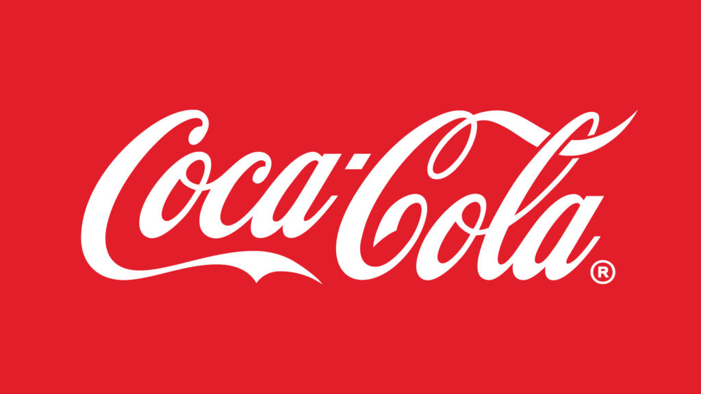
Robinson wrote the name in the Spencerian style then common in American business correspondence. Its looping capitals, changing stroke weight and long terminal flourishes made a commercial name feel like a personal signature. By 1887 the familiar script was in use, with “Trade mark” tucked into the sweeping tail of the first C. The logo was distinctive without needing a picture of a bottle, leaf or ingredient.
1890–1891: the ornate experiment
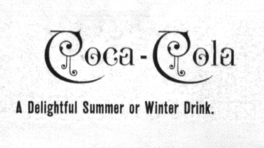
For a brief period, Coca-Cola departed dramatically from the clean script. The 1890 version added elaborate curls and music-like ornaments to the letters, creating the most decorative mark in the company’s chronology. It is fascinating precisely because it did not last.
The experiment shows the difference between decoration and distinctiveness. More flourishes did not make the name more ownable; they competed with the readable silhouette people were beginning to recognize. Coca-Cola soon returned to the Spencerian foundation, establishing an early pattern: new visual treatments could orbit the signature, but the core lettering was strongest when allowed to speak clearly.
1893–1958: standardizing a growing trademark
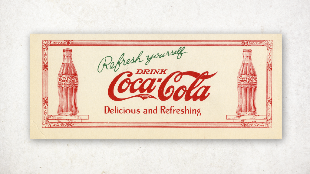
As Coca-Cola expanded, the wordmark became more controlled. The company’s trademark chronology records several changes in how legal language appeared around the script. “Trade mark” returned to the tail in the 1890s; “Registered” wording appeared there from 1903 into the early 1930s; and by 1941 trademark information had moved outside the lettering.
These may sound like small production details, but they reveal a brand turning a handwritten idea into a repeatable global asset. The 1920s rendering is cleaner and better balanced than the earliest version, yet its personality remains intact. The high capital Cs create anchors, the connected lowercase strokes make the word move as one unit, and the rising final flourish gives the long name a memorable finish.
During this period, another proprietary shape strengthened recognition: the contour bottle. Coca-Cola’s official bottle history says the company challenged suppliers in 1915 to create a package identifiable even in the dark or when broken on the ground. The resulting contour silhouette and the written signature reinforced each other. One made the product recognizable by touch and outline; the other made its name recognizable by rhythm.
1958: the fishtail gives the script a stage
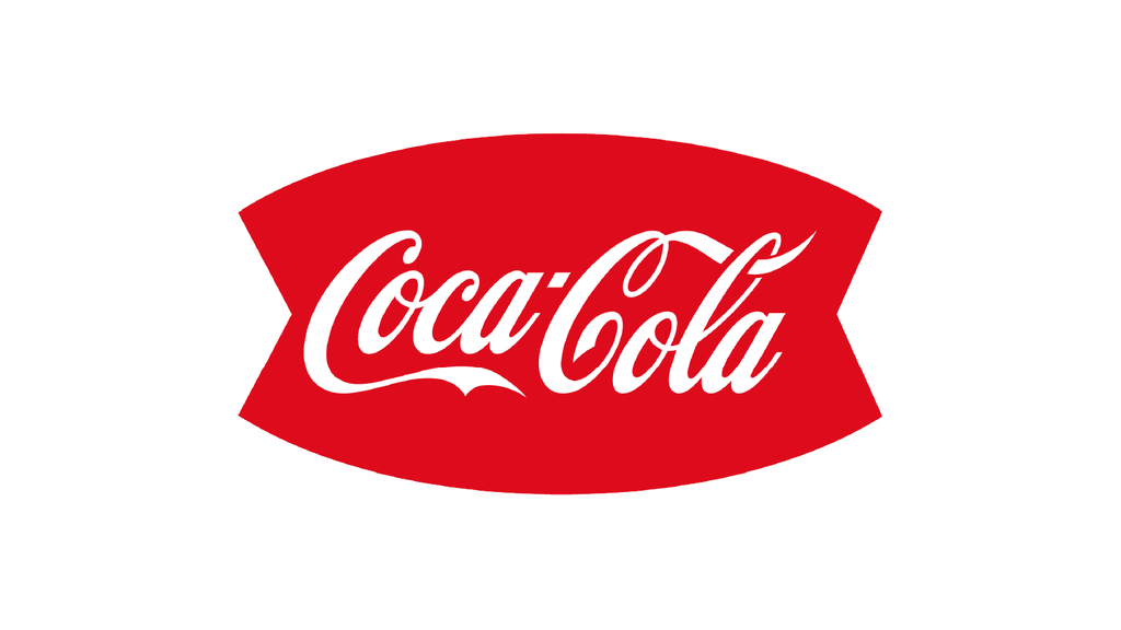
In 1958, the wordmark appeared inside an arched red shape commonly called the fishtail. The container created a bold field around the delicate script, allowing the logo to command more space on signs, vending machines and advertising.
The fishtail belongs unmistakably to mid-century graphic design: geometric, optimistic and built for high-impact commercial reproduction. It did not redraw the signature so much as frame it. That distinction is central to Coca-Cola’s evolution. Rather than asking the wordmark to follow every trend, the brand could update the shapes, color fields and campaigns surrounding it.
1969–1987: the Dynamic Ribbon arrives
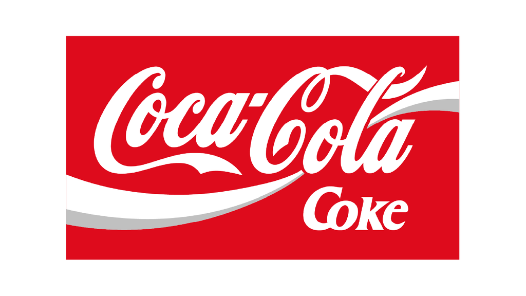
The 1969 visual system introduced two enduring devices. The Arden Square placed the white script in a red box, while the Dynamic Ribbon—also known as the wave—swept beneath it. The ribbon translated the drink into an abstract gesture: a flowing line that could suggest liquid, refreshment, motion and the contour of a smile without illustrating any one of them literally.
That system also solved practical problems. A red square made the identity easier to locate in busy retail environments, while the white wave organized secondary information and gave advertisements a consistent visual signature. During the 1980s, the ribbon became more tightly integrated with the wordmark, producing a compact logo that felt energetic even when static.
1993–2003: classic assets gain dimension
In the 1990s, Coca-Cola’s identity leaned into realism and packaging. The contour bottle, silver highlights, condensation, gradients and dimensional ribbons appeared throughout the brand world. The script still anchored the composition, but the supporting graphics were designed to make the product feel cold, tangible and immediate.
This was not merely ornament for ornament’s sake. Printing and screen production could now support richer imagery, and beverage advertising increasingly sold a sensory moment. Yet the era also demonstrated how much visual material the logo could accumulate before its central signature began to compete for attention.
2003–2007: the “Real” era turns everything up
The 2003 identity associated with the “Coca-Cola… Real” campaign amplified the ribbon with yellow accents and multiple flowing lines. It was bright, energetic and unmistakably a product of early-2000s branding, when depth, highlights and layered motion were used to communicate excitement.
The system was expressive, but complexity carries a cost. Detailed effects vary across printing methods, screen sizes and markets. A mark that feels dynamic on a large poster can become noisy on a small label or icon. Coca-Cola’s next move was therefore not another reinvention; it was an edit.
2007–present: confidence through subtraction
In 2007, the visual identity returned to a simpler combination of red, white, the Spencerian script and a single ribbon. Removing extra outlines, gradients and supporting colors restored the clarity of the brand’s strongest assets. The result felt both more contemporary and more historical because less styling stood between the viewer and the signature.
The company has continued to refine the broader system without replacing that core. Packaging programs have enlarged the script, used red more confidently and adjusted how the ribbon and Arden Square behave across formats. The logo can appear as red lettering on white, white lettering on red, or within campaign graphics and still retain the same unmistakable movement.
2026: one global system, familiar ingredients
In July 2026, Coca-Cola announced a sharpened global visual system rolling out across more than 200 markets and regions. Rather than unveiling an unfamiliar emblem, the company emphasized the assets it already owns: Coca-Cola Red and white, the Spencerian script, the Dynamic Ribbon and the Arden Square.
That decision is the logical outcome of the lineage. Coca-Cola’s identity does not need a fashionable replacement for its signature. It needs consistent rules that help a nineteenth-century wordmark work in contemporary motion, retail, social media, packaging and experiences. The refresh treats heritage as usable design material, not as an exhibit sealed behind glass.
Why the Coca-Cola logo endures
The wordmark’s durability comes from a rare combination of distinctiveness and flexibility. Its silhouette is recognizable before every letter is read. The paired capitals make the name rhythmic; the connecting strokes turn it into a single shape; and the script feels human in contrast with the geometric sans-serif identities that dominate many global categories.
Consistency has also compounded its value. Coca-Cola repeatedly modernized the stage instead of recasting the lead actor. The fishtail, square, ribbon, bottle and promotional graphics tell us when an execution was made, while the signature tells us who made it. Even the short-lived 1890 experiment strengthens the lesson: the brand became more recognizable when it returned to what was already uniquely its own.
The evolution is therefore not a straight march from old to new. It is a process of identifying which elements are temporary and which deserve protection. After more than a century, Coca-Cola’s most modern design choice may be its refusal to discard the handwritten idea that worked in 1887.
Sources and image notes
The dates and design milestones above draw from The Coca-Cola Company’s official trademark chronology, account of the drink’s 1886 beginnings, contour bottle history, and 2026 global identity announcement. Historical renderings come from Coca-Cola’s official logo history archive and are shown for editorial comparison. Coca-Cola and its logos are trademarks of The Coca-Cola Company; LogoEvolve is not affiliated with or endorsed by The Coca-Cola Company.
Coca-Cola’s commitment to a historic script contrasts with the frequent reinvention of Pepsi, while both show how a beverage identity must remain recognizable across packaging, advertising, and retail environments. Its packaging discipline also provides a useful counterpoint to Starbucks, whose identity increasingly depends on a standalone character symbol.