A corporate name learns to smile
Hasbro began as Hassenfeld Brothers in 1923 and grew into a company responsible for toys, games and entertainment properties with very different audiences. A corporate mark for that portfolio could not look like any one product. It needed to express play at a higher level.
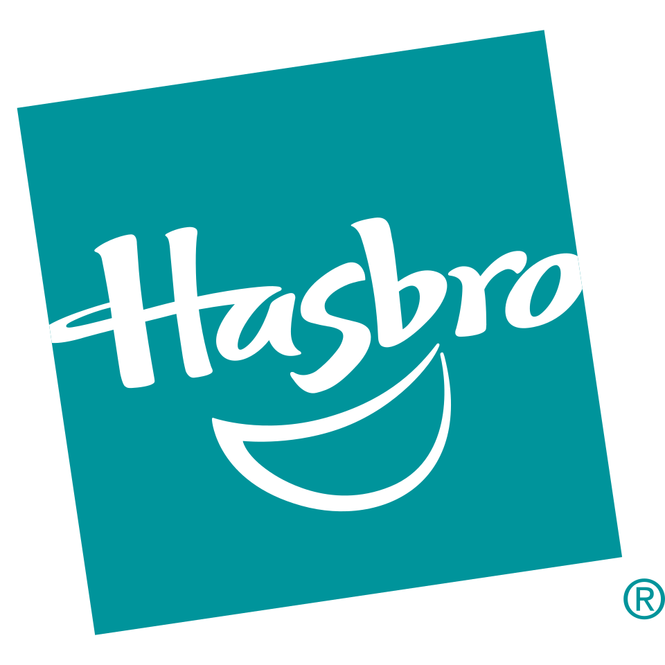
The late-1990s identity solved that problem with a tilted teal tile, a casual white script and a broad curved smile. The name looked handwritten rather than engineered, while the smile provided a simple emotional cue that could connect family games, action brands and preschool products.
The smile becomes the organizing idea
The most important feature is the sweeping curve beneath the wordmark. It supports the letters like a grin and gives the otherwise abstract tile a face-like personality. The angled square prevents the badge from feeling static, and the irregular script reinforces a sense of imagination.
This approach differs from product-specific identities such as LEGO or Mattel. Hasbro’s corporate logo has to sit above a portfolio, so it communicates a general promise of play rather than the character of one toy line.
Brighter blues modernize the tile
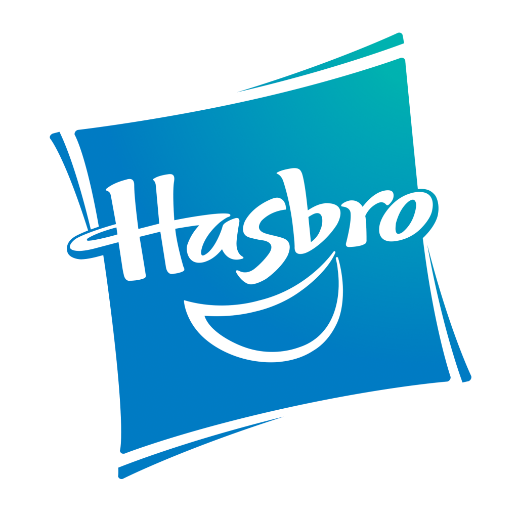
Around 2009, Hasbro refreshed the established construction rather than abandoning it. The tile moved toward brighter blue tones, the lettering became more polished and the smile remained the visual anchor. That continuity protected recognition while helping the mark reproduce across packaging, screens, corporate material and entertainment credits.
The current official logo still uses the same core ingredients: an energetic tilted field, a friendly script and the upward smile. Hasbro’s brand guidelines provide variants for controlled corporate use, showing that the mark operates as a formal company signature even though its personality stays playful.
A parent identity for many worlds
Hasbro’s challenge resembles that of other entertainment companies with broad portfolios. The logo must be present without overpowering properties that already have strong identities of their own. Its compact badge can endorse those experiences while remaining distinct from them.
By keeping the smile through its modernization, Hasbro preserved the part of the identity with the clearest emotional meaning. The evolution is modest but effective: the newer mark looks brighter and more digital while the same friendly gesture continues to link toys, games and entertainment alongside companies such as Nintendo.