Color television creates an unforgettable bird
NBC’s Peacock first appeared in 1956 to announce programming produced in “living color.” The original version was deliberately theatrical: eleven bright plumes opened behind a detailed white bird. NBCUniversal notes that it was initially a promotional device rather than the network’s primary logo, but viewers formed a powerful association between the bird, NBC and color broadcasting.
That distinction matters because NBC’s official identity continued to change around it. In 1959, John J. Graham designed the continuous-line “snake” ligature. Its interlocking N, B and C suited the clean, animated language of midcentury television and served as the primary network mark while the Peacock appeared around color programming.
The geometric N tests a new direction
In 1976, NBC introduced a red-and-blue geometric N created with Lippincott & Margulies. The abstract construction aimed to unify the company across divisions and align it with the modernist corporate identities of the period. It was visually strong, but it lacked the audience affection already attached to the bird.
Research inside NBC found that viewers saw the Peacock as an enduring network symbol. The 1979 “Proud N” responded by combining an outlined N with a simplified bird. For the first time, the Peacock officially moved from promotional imagery into the core brand identity.
Six feathers create the lasting symbol
For NBC’s 60th anniversary in 1986, designer Steff Geissbühler of Chermayeff & Geismar simplified the Peacock to six colored feathers representing six NBC divisions. A notch in the violet feather formed the beak, and the bird turned to face right—an intentional suggestion of looking forward.
The result is one of broadcasting’s most compact visual ideas. Unlike the elaborate 1956 illustration, the six-plume mark can be understood at icon size, animated on screen or paired with a wordmark. That economy helped it survive a media environment that expanded from a few broadcast channels to cable, websites, apps and streaming.
Digital refinements preserve the silhouette
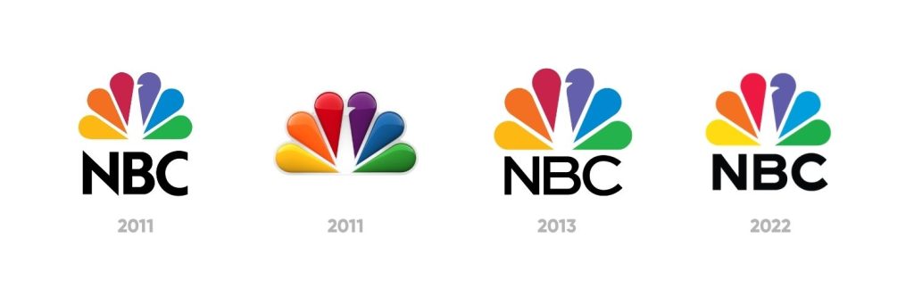
NBC adjusted spacing and typography through the 2010s. The 2022 version uses a heavier custom NBC Tinker wordmark and a slightly larger beak for small-scale legibility. The silhouette and color sequence remain familiar, so the update reads as maintenance rather than replacement.
The Peacock now sits among long-lived entertainment symbols such as Paramount, Warner Bros. and Disney. Its unusual path—from a color-TV announcement to a formal corporate mark—shows that audiences sometimes decide which visual asset carries the greatest brand value.