A merger created a visual problem
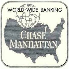
Chase Manhattan Bank was formed in 1955 from two institutions with deep but very different histories: Chase National Bank and the Bank of the Manhattan Company. The first combined emblem tried to carry several pieces of that inheritance at once. It was meaningful, but it was also complicated—more like an institutional seal than a symbol built for a fast-growing modern bank.
David Rockefeller asks for a new kind of bank mark
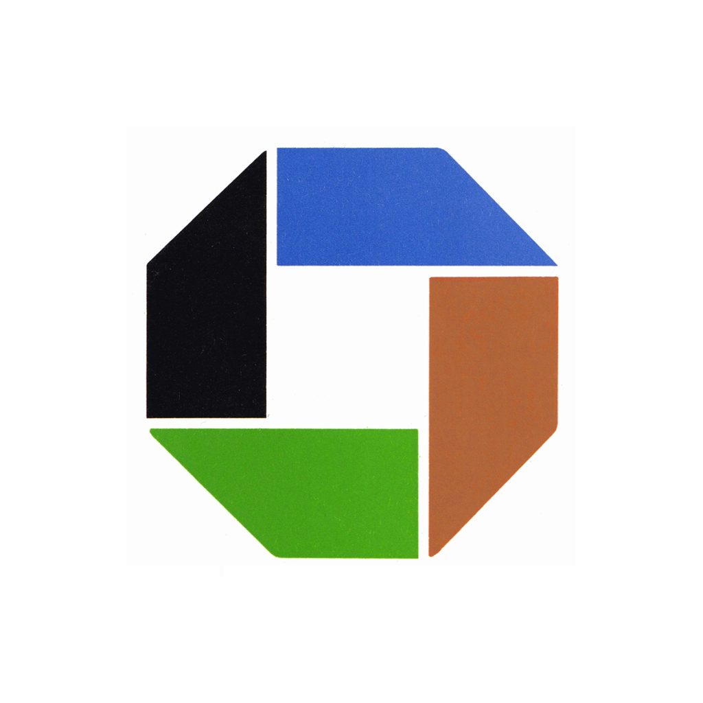
JPMorganChase’s official history says David Rockefeller commissioned Chermayeff & Geismar to create a logo that could match the modern architecture of the bank’s new Lower Manhattan headquarters and communicate global reach. The result, unveiled on November 21, 1960, was an octagon assembled from four wedge-like forms around a central square.
The octagon makes abstraction credible
The designers described activity centered around a square and growth from a central foundation. More important than any single interpretation was the confidence of the decision: the logo did not show coins, a building, an eagle, or another familiar banking object. It asked the public to learn a purely geometric symbol. That made Chase an influential early example of American corporate modernism.
Color and typography evolve around a stable core
Early presentations used multiple colors and patterns, while later systems paired the octagon with increasingly direct Chase wordmarks. The underlying geometry changed remarkably little. In 2004 the bank adopted the solid blue octagon that remains associated with its retail business, strengthening consistency across branches, cards, apps, and advertising.
A durable symbol outlives mergers
Chase’s corporate family continued to change, eventually becoming part of JPMorgan Chase, yet the retail brand retained the octagon. Like the interlocking geometry in the Mastercard identity, it succeeds because the construction is recognizable before a viewer reads the name. More than six decades after its debut, the mark still looks orderly, active, and unmistakably modern.