A symbol built for a new kind of entertainment
PlayStation entered the market in Japan in December 1994 and reached North America and Europe in 1995. Sony’s new console needed an identity that felt distinct from both the Sony corporate wordmark and the established language of toy brands. The solution combined a custom PlayStation wordmark with a compact symbol that could live on hardware, packaging, startup screens, controllers, and game cases.
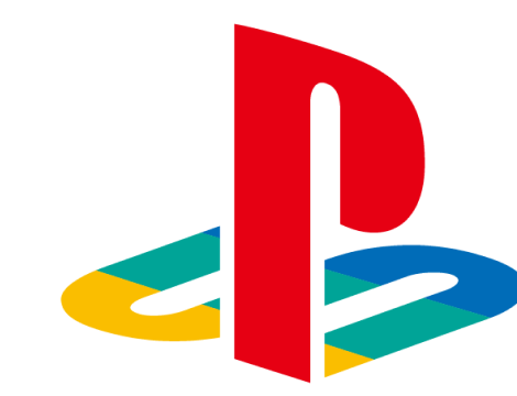
The family mark is a visual construction rather than a simple monogram. A vertical red P stands in front while the S appears to lie in perspective beneath it. The launch-era color version adds yellow, green, and blue planes to the base, creating depth and making the symbol feel related to the early console’s transition into three-dimensional game worlds.
The original color family mark
PlayStation’s official 30th-anniversary artwork revived the original multicolor mark, making its construction especially clear. The upright P supplies the immediate initial, but the flattened S is what makes the emblem memorable. It behaves like both a letter and a shadow, turning two characters into one spatial object.
The colors gave the early identity an accessible, energetic tone without making the PlayStation name itself difficult to read. When paired with the black launch-era wordmark, the symbol could carry color while the typography remained neutral. That division of labor made the system flexible across printed manuals, monochrome hardware markings, and full-color retail packaging.
From multicolor emblem to monochrome standard
As PlayStation expanded into a family of consoles and network services, monochrome versions of the mark became increasingly central. The current official site uses a single-color family symbol whose form is essentially the same P-and-S construction introduced at launch. Removing the internal color divisions makes the emblem easier to reverse, animate, scale, and place beside different product identities.
The change is best understood as simplification rather than replacement. The silhouette was already strong enough to survive without its launch palette. In black or white, the mark can sit quietly on a console, appear in a navigation bar, or anchor a blue digital environment without creating a second competing color system.
A family mark above changing console logos
PlayStation console names have changed from the original PlayStation through PS2, PS3, PS4, and PS5, and those format logos have not all used identical typography. The family mark provides continuity above those generational identities. Sony’s official PS5 design story explains that the PS5 product logo retained the PS4 style so the two formats would remain intuitively related and visually compatible.
That decision illustrates the broader strength of the PlayStation system. Recognition does not depend on redesigning the family symbol for every generation. Instead, the permanent emblem, the PlayStation wordmark, the blue brand environment, and generation-specific marks work at different levels.
Why the original geometry still works
The family mark compresses a surprisingly complex idea into a small footprint. It reads as initials, suggests dimensional space, and produces a silhouette recognizable even without the PlayStation name. Few technology identities from the mid-1990s retained that much of their original construction while adapting so comfortably to modern interfaces.
Compared with Nintendo, which places almost all recognition in a framed wordmark, PlayStation can separate its symbol from its name. Compared with Microsoft, whose identity connects many businesses through a simple geometric window, PlayStation’s emblem remains tied to a specific entertainment ecosystem. Its evolution proves that a strong launch idea can be modernized through color and context without losing its underlying form.