From waterfront seal to a wordless global icon
Starbucks has kept the same central character since 1971: a twin-tailed Siren chosen to connect the young Seattle coffee merchant with seafaring history and the long voyage of coffee. Nearly every major revision has moved in the same direction. Detail has been reduced, the face has been brought closer, and the company name has gradually become less necessary.
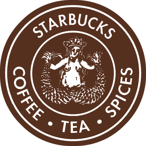
1971: coffee, tea, spices and a detailed Siren
The original Terry Heckler design was brown, circular and deliberately old-world. Its outer ring spelled out Starbucks Coffee, Tea and Spices, describing what the Pike Place Market shop sold before Starbucks became known primarily as a cafe. At the center, a detailed two-tailed figure recalled woodcut illustration and maritime trade.
Brown connected naturally to roasted coffee and paper packaging. The dense line work gave the mark the feeling of a specialty merchant’s seal, but it also limited how clearly the Siren could reproduce at small sizes. The identity worked as a local emblem; a growing retail system would need stronger color and simpler forms.
1987: green signals a new cafe era
When Howard Schultz’s Il Giornale acquired Starbucks in 1987, Heckler created a combined identity. Starbucks’ official history says green replaced brown, the Siren received a modernized treatment and the surrounding name became shorter. The palette felt fresher and more visible on storefronts, cups and aprons, while black and white contrast strengthened the circular badge.
The figure was also edited for a broader public setting. Her hair covered more of the torso, the drawing became cleaner and the crown and twin tails remained as identifying features. Two stars separated the words in the outer band, producing the balanced emblem remembered by customers during Starbucks’ rapid expansion.
1992: the camera moves closer
The 1992 revision effectively zoomed in. The Siren’s face became larger, while the lower portion of the twin tails moved beyond the inner circle. This improved visibility on cups and signs and shifted attention from the mythological body to a welcoming face. The wording still taught the brand name, but the central character was becoming strong enough to lead.
This crop is a useful lesson in logo evolution: simplification does not always mean redrawing every line. Changing scale and framing can transform which part of an existing symbol customers notice first.
2011: the Siren leaves the ring
For Starbucks’ 40th anniversary, the company removed the surrounding name, black field and stars. The Siren became a green-and-white standalone icon. Starbucks’ current creative guidance calls the Siren the face of the brand and says the preferred approach is to use her unlocked from the wordmark.
The change reflected both recognition and ambition. Starbucks was selling more than coffee, and a symbol without category wording could stretch across food, packaged goods, merchandise and digital experiences. The brighter green, cleaner contours and generous open field also perform better as an app icon and small social avatar.
A little asymmetry keeps her human
The 2011 artwork looks symmetrical at a glance, yet subtle differences remain in the face. That restraint prevents the icon from feeling mechanically mirrored. Across forty years of editing, Starbucks did not discard the oddness that made the Siren memorable; it removed everything that competed with her.
Sources and image notes
Starbucks’ official logo history documents the 1971 and 1987 changes, while its creative expression guide explains current Siren usage. Historical photographs are preserved by Wikimedia Commons. The marks are shown for identification, criticism, commentary and education. Starbucks and the Siren are trademarks of Starbucks Coffee Company; LogoEvolve is not affiliated with Starbucks.
Starbucks progressively removed words while enlarging its siren, a confidence in symbol-only recognition comparable to Nike and distinct from the name-centered beverage identity of Coca-Cola.
Starbucks and Pepsi both simplified detailed identities into symbols that can stand without a full wordmark. Compare that approach in the Pepsi logo history.
Compare another familiar coffee brand’s move toward a simpler identity in Dunkin’s logo history.