Dave Thomas gives the restaurant a family name
Dave Thomas opened the first Wendy’s restaurant in Columbus, Ohio, on November 15, 1969. He named it after his daughter Melinda Lou, whose childhood nickname was Wendy. The logo made that personal connection visible through a freckled girl with red pigtails, creating a character that felt more like a family portrait than a corporate symbol.
Old-fashioned detail supports the original promise
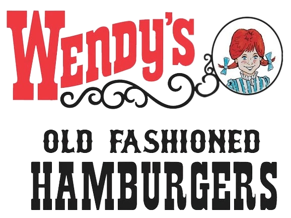
The earliest emblem combined the girl’s portrait with elaborate red lettering, scrollwork, and the phrase “Old Fashioned Hamburgers.” Its nineteenth-century visual references reinforced the idea of hamburgers made with care rather than anonymous assembly-line food. The composition was intricate, but every part contributed to a deliberately nostalgic personality.
A compact badge works across a growing chain
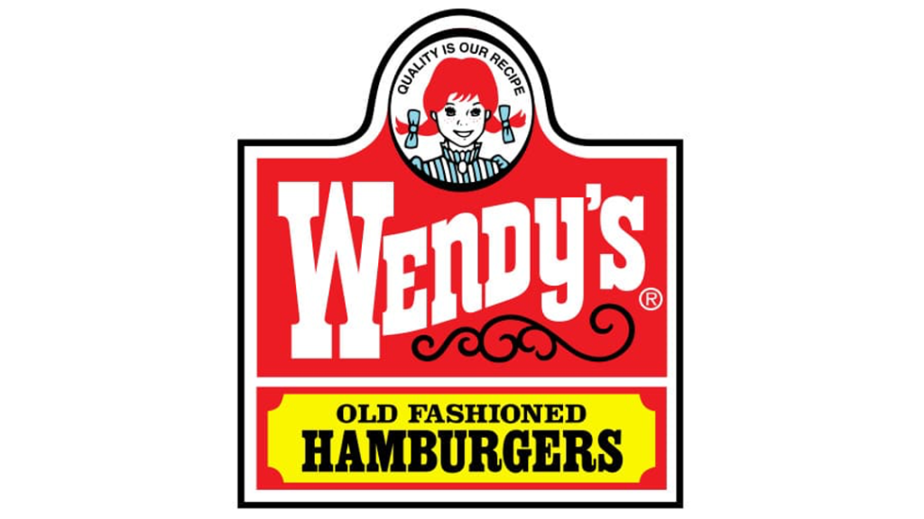
As Wendy’s expanded, the identity became brighter and more contained. The long-running 1980s system placed the mascot above a strong wordmark, often using red, white, yellow, and black. It was easier to deploy on signs, packaging, cups, and national advertising while keeping both the founder’s family connection and the old-fashioned positioning.
The 2013 redesign removes the restaurant costume
Wendy’s official history calls the 2013 update its first major logo change in 30 years. The ornate frame and “Old Fashioned Hamburgers” language disappeared. A red handwritten wordmark replaced the rigid western-style lettering, while Wendy’s portrait became larger, cleaner, and more expressive.
The mascot makes Wendy’s unusually human
Unlike the symbol-led systems of McDonald’s and Burger King, Wendy’s continues to lead with a specific person. The modern logo is simpler, but it does not abandon the freckles, pigtails, or blue ribbons that make the character recognizable. Its evolution shows how a brand can modernize dramatically while protecting the emotional detail at its center.