A crop-dusting company grows into an airline
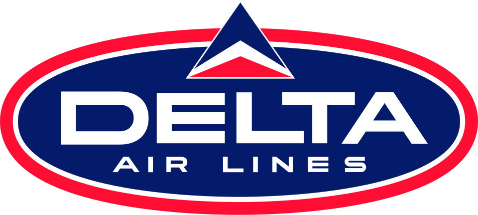
Delta traces its roots to a 1920s crop-dusting operation. Its early identities naturally emphasized aviation and the company name, but the most enduring idea arrived as commercial jet travel reshaped the industry. Delta’s official history dates the red, white, and blue triangular “widget” to 1959.
The widget connects a letter with flight
The triangular form could be read as the Greek letter delta, the swept wing of an aircraft, or an upward arrow. That ambiguity made it flexible: the mark was meaningful without becoming a literal illustration. Early versions combined the widget with broad lettering and cues associated with the optimism and speed of the jet age.
Stronger typography supports a larger network
By the 1980s, the symbol appeared beside a confident all-capital wordmark. The relationship was compact and easy to apply across aircraft, ticket jackets, airport signs, and advertising. As Delta’s network expanded, the identity needed to remain legible from a terminal window as well as on a printed timetable.
The traditional widget returns
Delta experimented with softer and more dimensional versions around the turn of the millennium. In 2004, the airline says it returned to a more traditional widget. The 2007 identity then gave the red form a folded, dimensional surface and paired it with a dark blue wordmark, reducing the palette while retaining the established silhouette.
Continuity gives an airline confidence
Airline brands must work on moving aircraft, tiny app icons, uniforms, lounges, and crowded airport screens. Delta’s answer has been to refine rather than discard its central geometry. Much like the crane in the Lufthansa logo, the widget connects decades of travel even as aircraft, routes, and media continue to change.