Three stars before electronics
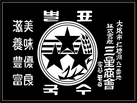
Samsung was founded in 1938 as a trading company, long before televisions, semiconductors, and smartphones defined the name. “Samsung” means three stars in Korean, and the earliest mark made that meaning literal. Stars, Korean lettering, and agricultural imagery formed a seal-like composition tied to the company’s original trading activities.
As Samsung entered new industries, the identity became less illustrative. A 1969 electronics-era mark retained three stars but organized them beside a stronger name treatment. It was a transitional design: the founding meaning remained visible while the company prepared to communicate through mass-produced consumer technology.
The English name becomes global
Samsung’s official history identifies 1993 as the year of a major corporate identity program. The company wrote its name in English and placed it across a blue ellipse. Samsung explained that the ellipse represented the world moving through space, expressing innovation and change while helping one identity travel across international markets.
The custom lettering made the name more distinctive than a standard typeset word. Openings cut through the A and G created forward movement, and the angled ellipse reinforced the sense of orbit. Blue supplied consistency across electronics, appliances, sponsorships, packaging, and corporate material.
The ellipse steps aside
By 2015 Samsung increasingly used the wordmark without the enclosing oval. Removing the container gave the letters more room and made the identity easier to place on narrow phone bezels, televisions, appliances, software screens, and retail environments. The most valuable part of the 1993 system—the recognizable letterforms—was strong enough to stand alone.
This evolution parallels the digital simplification seen at Google and Microsoft. Each retained a familiar verbal identity while reducing extra effects or structures that were less necessary in responsive interfaces.
A name designed to cross categories
Samsung’s current wordmark does not depict a phone, television, or chip. That neutrality is useful for a company operating across many categories: the same signature can appear on a foldable device, a refrigerator, a semiconductor facility, or a stadium display without favoring one product line.
The lineage moves from literal meaning to adaptable recognition. Three stars explained the name, the ellipse announced global ambition, and the standalone wordmark now carries decades of accumulated awareness with minimal visual equipment.
Samsung and Intel both moved away from enclosing shapes as their identities had to work across smaller digital surfaces. Explore the Intel logo history.
Continue comparing related identity systems with Sony and Panasonic.
For another identity comparison, explore the LG logo history.