A name that naturally becomes a picture
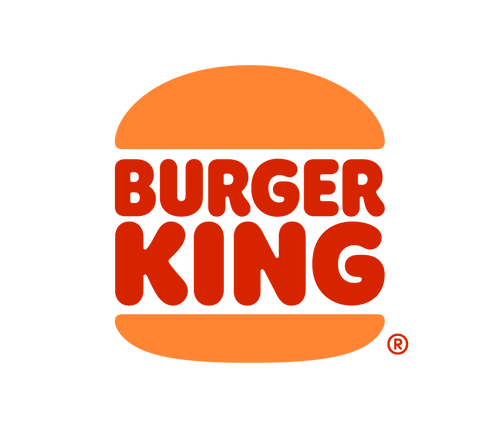
Burger King was founded in 1954, and its name offered designers an unusually direct visual idea: put the words inside a burger. The strongest versions of the identity have treated the two bun halves as a container, turning the restaurant name and its signature product into one compact emblem.
This structure is effective because it is readable even before every letter is processed. The rounded bun silhouette signals food, while the stacked words fill the center like ingredients. It also produces a self-contained badge that works on roadside signs, wrappers, restaurant facades, and digital icons.
The bun badge becomes the heritage anchor
During the late twentieth century, Burger King established the warm red, orange, and yellow palette and the stacked-word bun construction that many customers still associate with the brand. Later versions added a blue crescent and tilted the composition, giving the badge more motion and a glossy, turn-of-the-millennium character.
That more complex mark remained recognizable, but its outlines, highlights, and surrounding swoosh created extra visual information. As ordering moved toward mobile screens and simple interface icons, the underlying bun idea was stronger than the added dimensional effects.
The 2021 return to simplicity
Restaurant Brands International described Burger King’s 2021 launch as its first global visual identity update in twenty years. The work unified the logo, colors, uniforms, restaurant design, digital platforms, and packaging. Instead of inventing a new symbol, the company returned to the most distinctive part of its own history.
The current badge removes the blue crescent and dimensional styling. Thick red lettering sits between two warm orange bun shapes, with proportions that feel soft, substantial, and food-focused. The forms resemble a refined version of the heritage bun logo while being built for contemporary reproduction.
Why retro can still be modern
The redesign is often described as retro, but its usefulness is modern. Flat color scales predictably, prints cleanly, animates easily, and stays legible in an app icon. Custom rounded typography gives the mark personality without depending on shadows or gradients. The broader palette and illustration system can add variety while the primary badge stays simple.
Compare Burger King with McDonald’s, which can often omit its name entirely, or KFC, which centers a founder portrait. Burger King keeps product and name locked together. Its evolution shows that modernization sometimes means removing recent additions and rediscovering the clearest idea already present in a brand’s archive.